Chapter 15 附录1 图可视化
#用于数据
library(janeaustenr)
#用于分词
library(tidytext)
library(dplyr)
library(stringr)

austen.word <- austen_books() %>%
  group_by(book) %>%
  mutate(linenumber = row_number(),
         chapter = cumsum(str_detect(text,
                                     regex("^chapter [\\divxlc]",
                                           ignore_case = TRUE)))) %>%
  unnest_tokens(word, text)%>%
  count(word, sort = TRUE) %>%
  mutate(book = as.factor(book))%>%
  #筛选Emma这个小说
  #filter(book == "Emma")%>%
  #显示前20个高频词
  head(60)

# install.packages("ggpubr")
#
# library(ggpubr)
library(tidyverse)
library(languageR)
data("lexdec")

austen.word  %>%
  #给高频词排序
  mutate(word = reorder(word, n)) %>%
  ggplot(aes(n, word)) +
  geom_col() +
  labs(y = NULL)
# # sorted first by book, then by count
# nameorder <- austen.word$word[order(austen.word$book,
#                                     austen.word$n)]
#
# # Turn name into a factor, with levels in the order of nameorder
# austen.word$word <- factor(austen.word$word, levels = nameorder)
15.1 条形图(Bar plots)
15.1.1 基于频数
ggplot(austen.word,
       aes(x = reorder(word, n), y = n, fill = book)) +
  geom_col(colour = "black") +
  #scale_fill_manual(values = c("#669933", "#FFCC66")) +
  xlab("Words")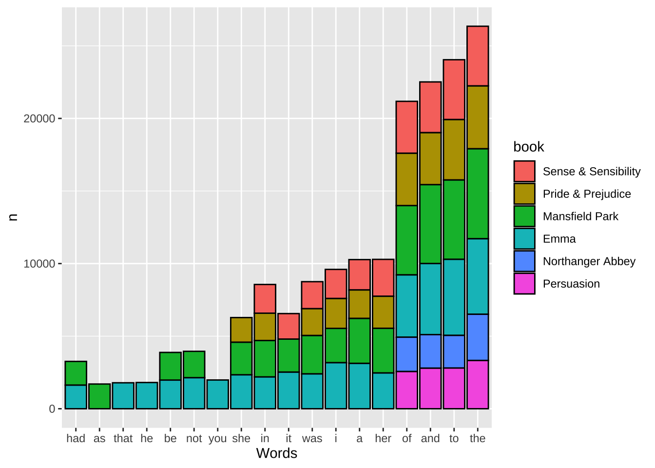
ggplot(austen.word,
       aes(x = reorder(word, n), y = n, fill = book)) +
  geom_col(colour = "black") +
  #scale_fill_manual(values = c("#669933", "#FFCC66")) +
  xlab("Words")+
  facet_grid(book ~ ., scales = "free_y", space = "free_y")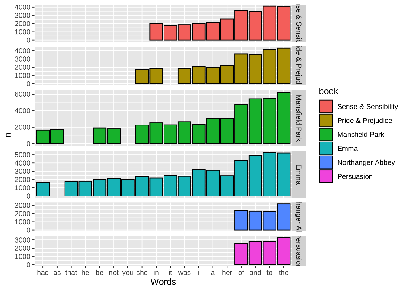
ggplot(austen.word,
       aes(y = reorder(word, n), x = n, fill = book)) +
  geom_col(colour = "black") +
   scale_fill_brewer(palette = "Pastel1")+
  xlab("Words")+
  facet_grid(book ~ ., scales = "free_y", space = "free_y")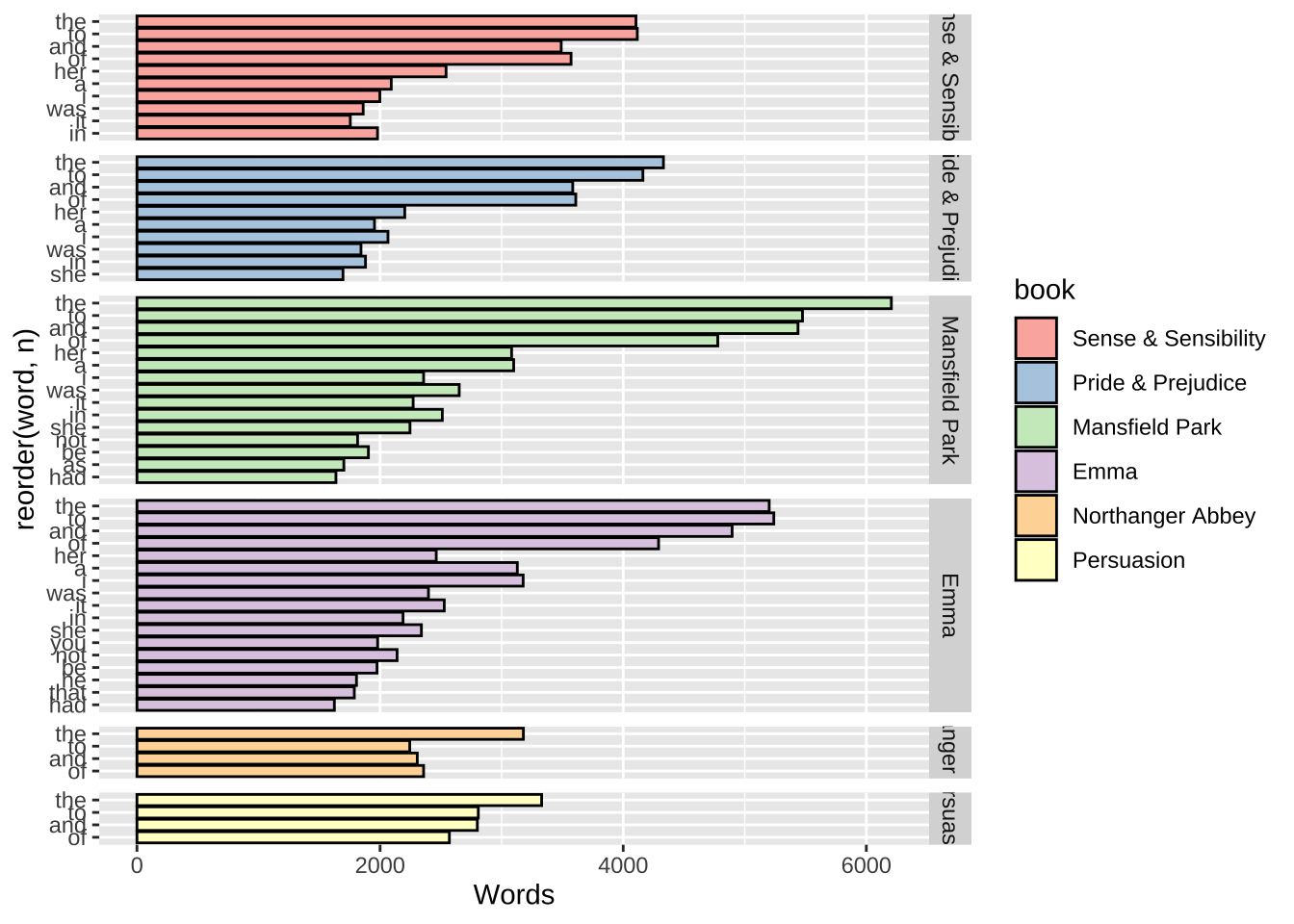
# Cleveland Dot Plot
ggplot(austen.word,
       aes(x = n, y = reorder(word, n))) +
  geom_segment(aes(yend = word), xend = 0, colour = "grey50") +
  geom_point(size = 3, aes(colour = book)) +
  scale_colour_brewer(palette = "Set1",
                      limits = unique(c(austen.word$book))) +
  theme_bw() +
  theme(
    panel.grid.major.y = element_blank(),   # No horizontal grid lines
    legend.position = c(1, 0.55),           # Put legend inside plot area
    legend.justification = c(1, 0.5)
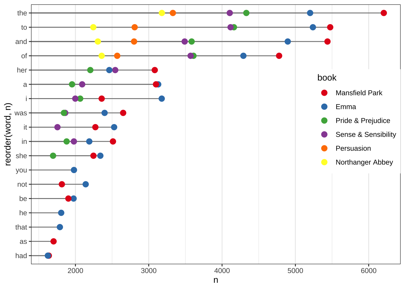
  )
ggplot(austen.word, aes(x = n, y = reorder(word, n))) +
  geom_segment(aes(yend = word), xend = 0, colour = "grey50") +
  geom_point(size = 3, aes(colour = book)) +
  scale_colour_brewer(palette = "Set1",
                      limits = unique(c(austen.word$book)),
                      guide = FALSE) +
  theme_bw() +
  theme(panel.grid.major.y = element_blank()) +
  facet_grid(book ~ ., scales = "free_y", space = "free_y")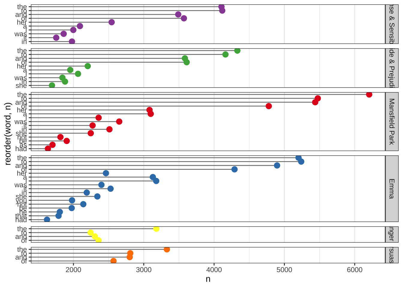
15.1.2 基于平均值
#bar plot
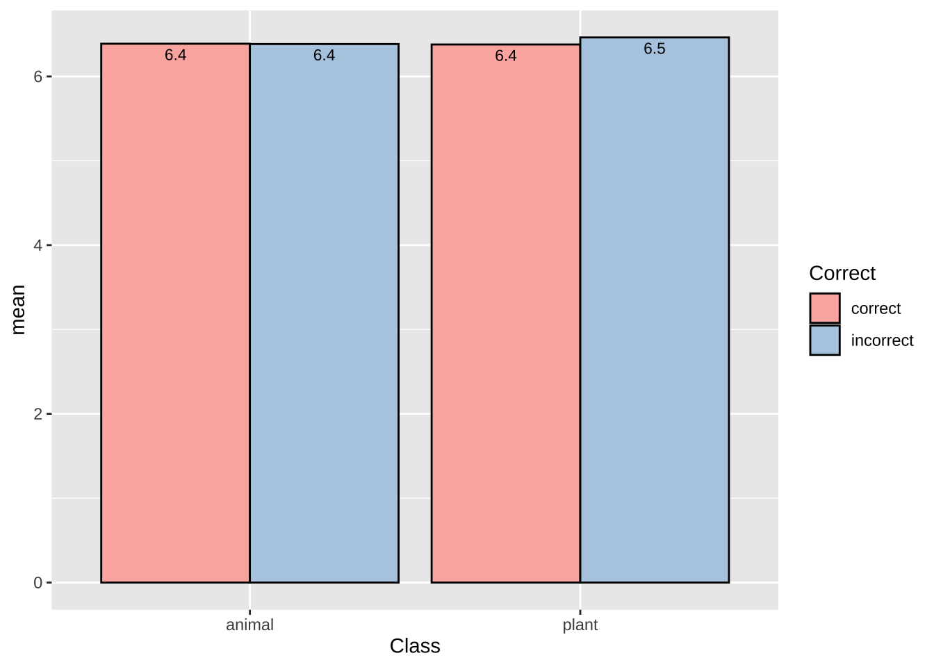
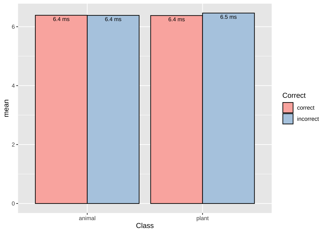
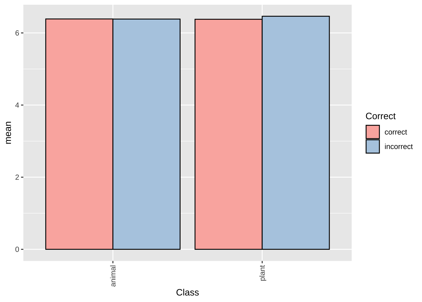
lexdec.plt = lexdec%>%
  group_by(Class, Correct)%>%
  summarise(mean = mean(RT))%>%
  ggplot(aes(Class, mean, fill = Correct))+
  geom_col(position = "dodge", colour = "black") +
  scale_fill_brewer(palette = "Pastel1")
## `summarise()` has grouped output by 'Class'. You can override using the `.groups` argument.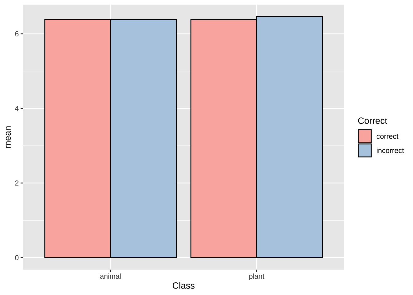
15.1.3 调整柱的宽度和之间的距离
  lexdec%>%
  group_by(Class, Correct)%>%
  summarise(mean = mean(RT))%>%
  ggplot(aes(Class, mean, fill = Correct))+
  # 去掉下面这行
  #geom_col(position = "dodge", colour = "black") +
  scale_fill_brewer(palette = "Pastel1")+
  # 调整柱的宽度和之间的距离
  geom_col(width = 0.3, position = position_dodge(0.7))
## `summarise()` has grouped output by 'Class'. You can override using the `.groups` argument.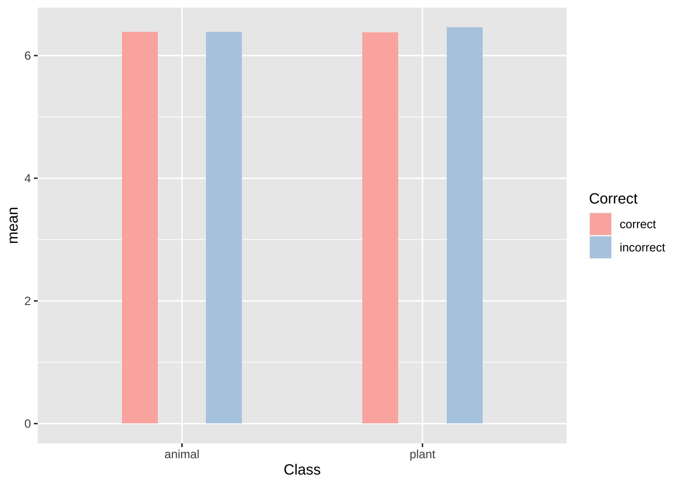
15.2 瓦片图(tile plot)
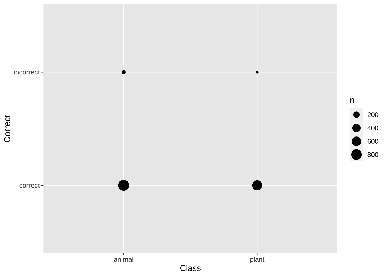
对于两个分类变量,我们可以使用交叉表(contingency table)来描述两个分类变量之间的协变性,显示各自的频率。
##
##             F   M
##   English 553 395
##   Other   553 158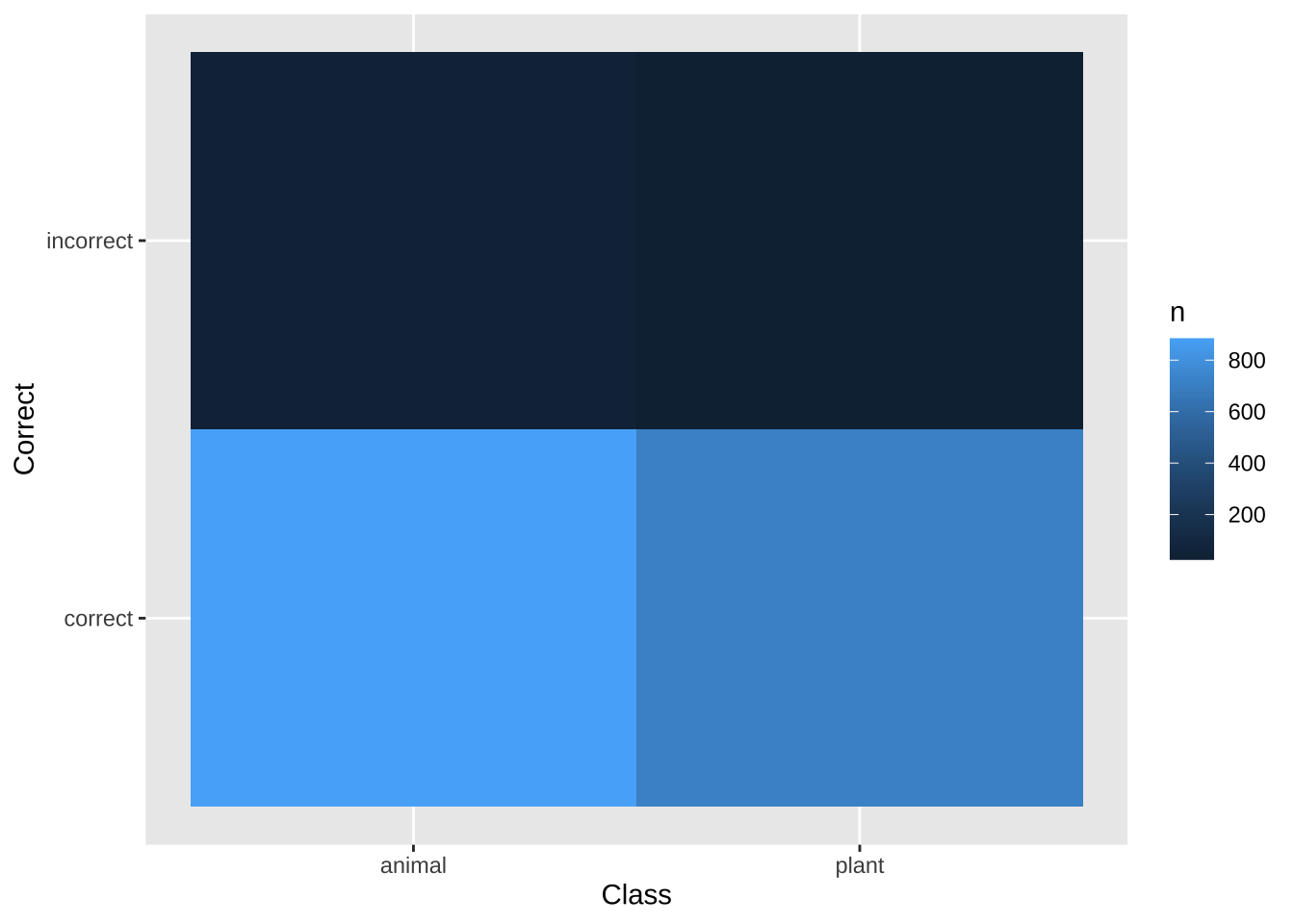
# You may need to install first, with install.packages("vcd")
library(vcd)

df.lexdec = lexdec%>%
  count(Class, Correct, Complex)


# Split by Admit, then Gender, then Dept
mosaic( ~ Class+ Correct + Complex, data = df.lexdec)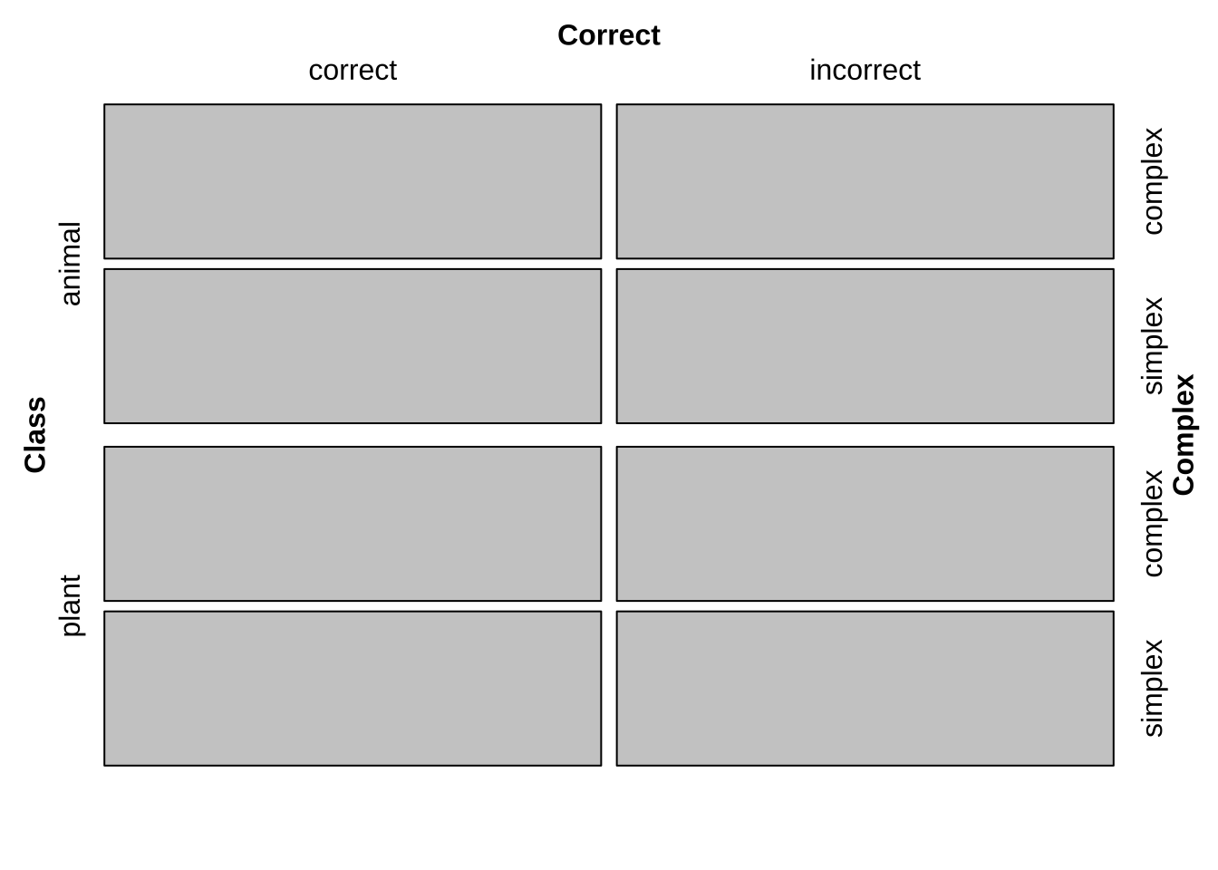
mosaic( ~ Class+ Correct + Complex, data = df.lexdec,
       highlighting = "Class",
       highlighting_fill = c("lightblue", "pink"),
       direction = c("v","h","v"))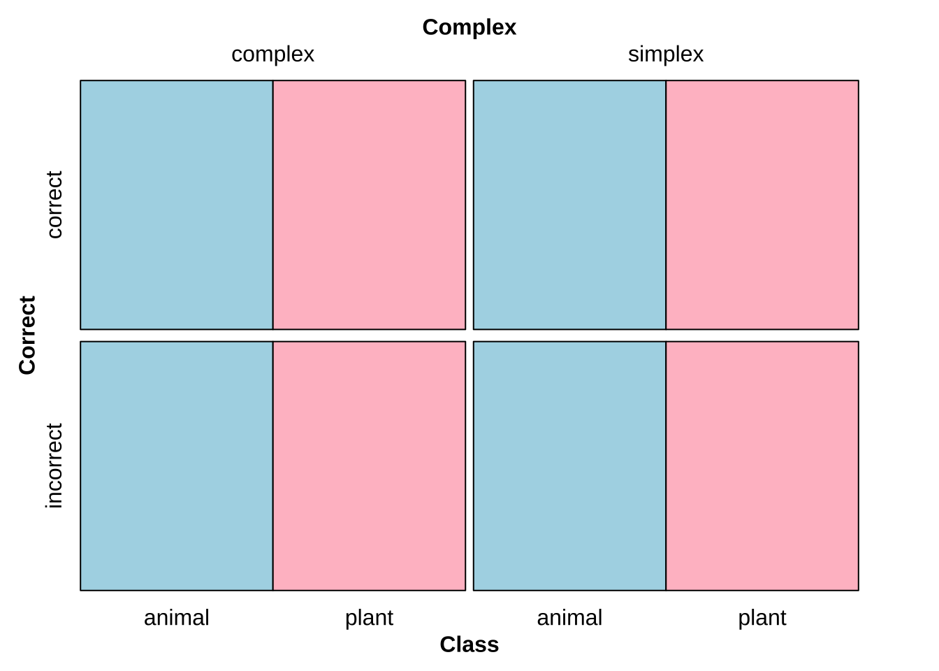
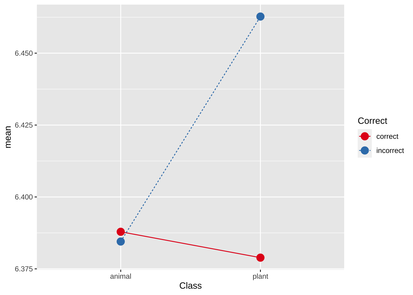
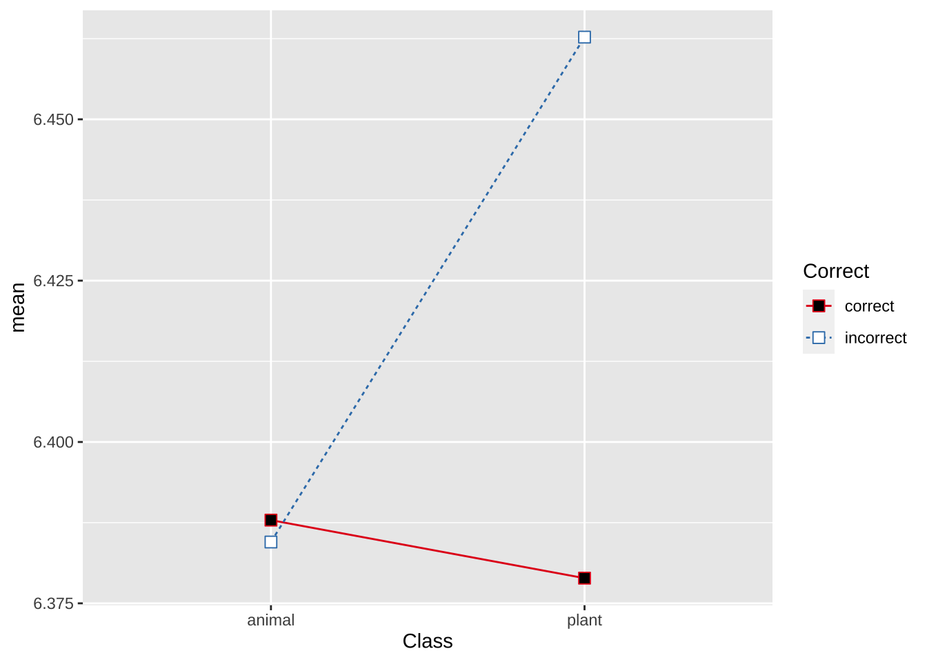
15.3 线图
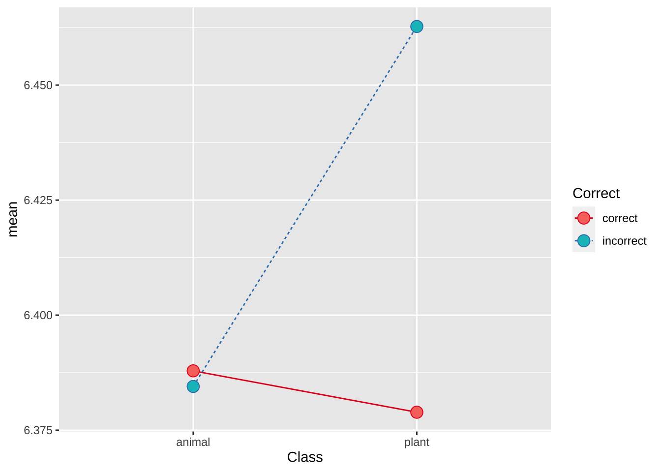
lexdec.line.plt = lexdec%>%
  group_by(Class, Correct)%>%
  summarise(mean = mean(RT))%>%
  ungroup()%>%
  ggplot(aes(Class, mean,
             # 一定要有group把数据连起来
             group = Correct,
             color = Correct,
             linetype = Correct,
             fill = Correct))+
  #geom_point() +
  geom_line() +
  scale_colour_brewer(palette = "Set1")
## `summarise()` has grouped output by 'Class'. You can override using the `.groups` argument.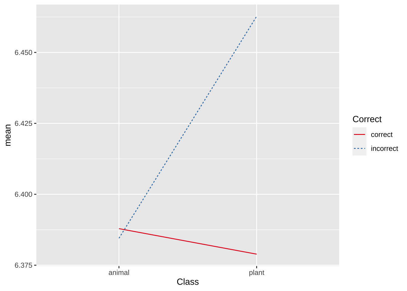
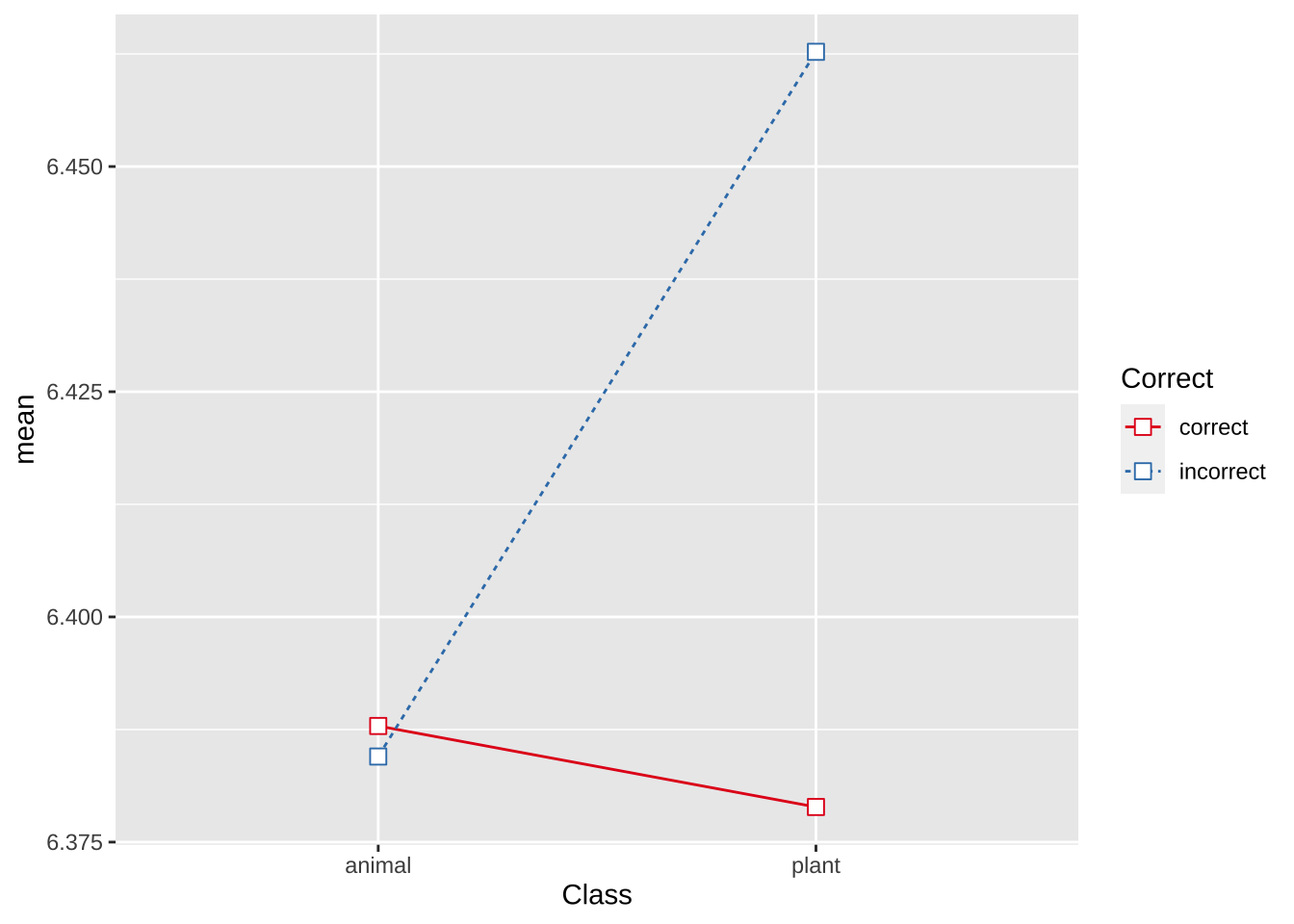
lexdec%>%
  group_by(Class, Correct)%>%
  summarise(mean = mean(RT))%>%
  ungroup()%>%
  ggplot(aes(Class, mean,
             # 一定要有group把数据连起来
             group = Correct,
             color = Correct,
             linetype = Correct))+
  scale_colour_brewer(palette = "Set1")+
  geom_line(position = position_dodge(0.2)) +   # Dodge lines by 0.2
  geom_point(position = position_dodge(0.2),
             size = 4)# Dodge points by 0.2
## `summarise()` has grouped output by 'Class'. You can override using the `.groups` argument.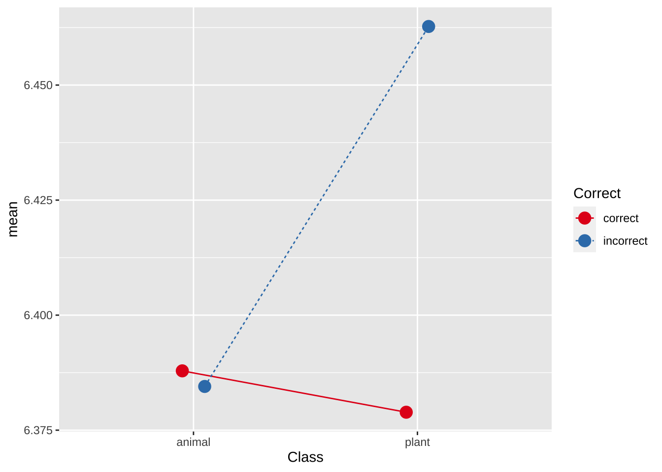
# Create a simulated dataset
set.seed(123)  # For reproducibility
years <- 1994:2023
population_estimate <- 100 + (years - 1994) * 2 + rnorm(length(years), 0, 10)
lower_ci <- population_estimate - 1.96 * 10
upper_ci <- population_estimate + 1.96 * 10

old.cn <- data.frame(
  Year = years,
  PopulationEstimate = population_estimate,
  LowerCI = lower_ci,
  UpperCI = upper_ci
)

# Plotting with ggplot2
ggplot(old.cn , aes(x = Year, y = PopulationEstimate)) +
  geom_line(color = "blue") +
  geom_ribbon(aes(ymin = LowerCI, ymax = UpperCI), alpha = 0.2) +
  labs(
    title = "China's Elderly Population with 95% Confidence Interval",
    x = "Year",
    y = "Population Estimate (in millions)"
  ) +
  theme_minimal()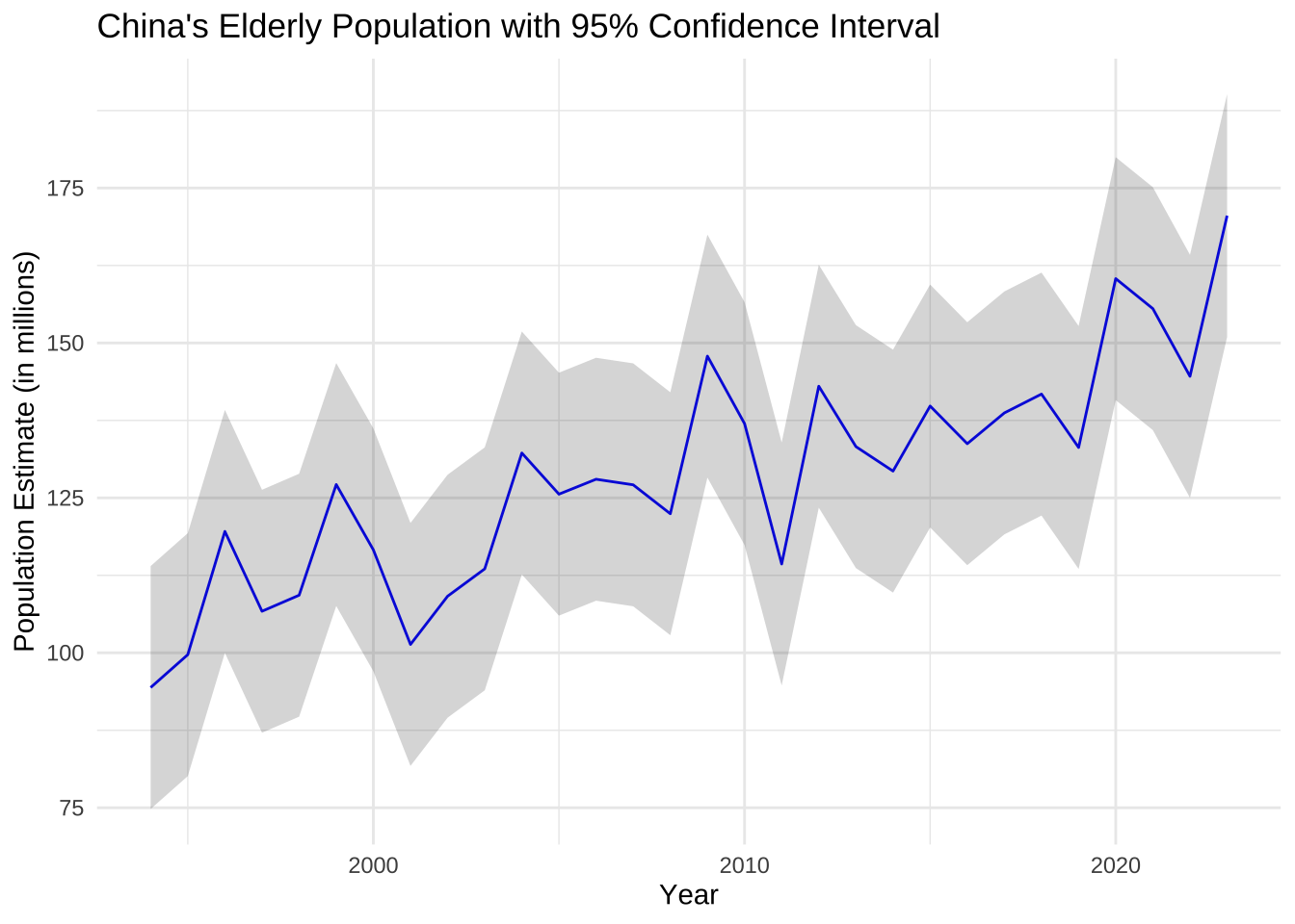
# With a dotted line for upper and lower bounds
ggplot(old.cn , aes(x = Year, y = PopulationEstimate)) +
  geom_line(aes(y = LowerCI), colour = "grey50", linetype = "dotted") +
  geom_line(aes(y = UpperCI), colour = "grey50", linetype = "dotted") +
  geom_line()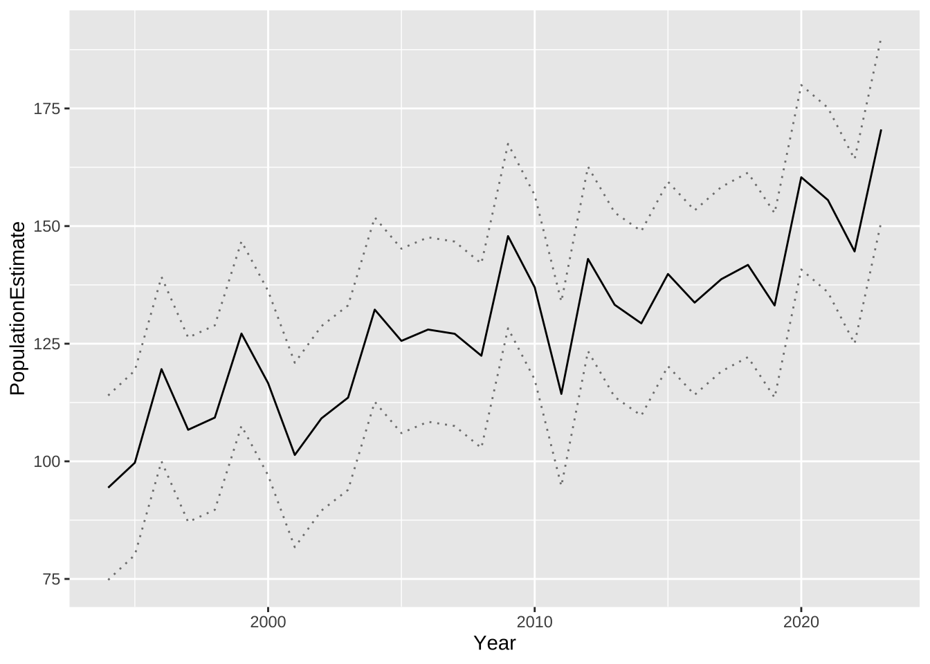
15.4 散点图
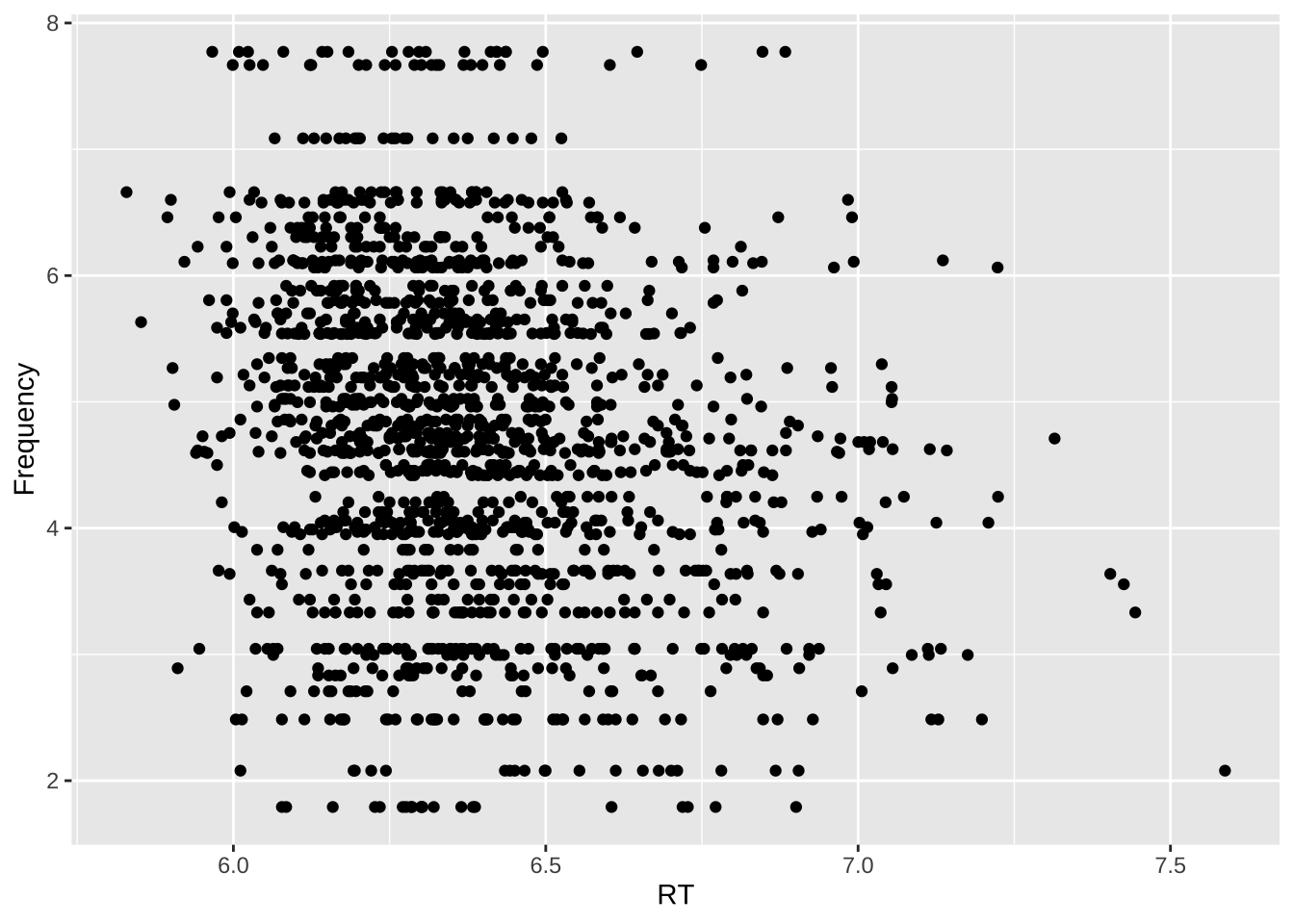
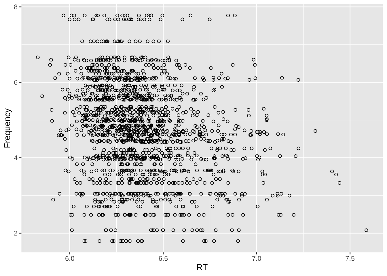
lexdec%>%
  ggplot(., aes(x = RT, y = Frequency,
                shape = NativeLanguage, colour = NativeLanguage)) +
  geom_point()
lexdec%>%
  ggplot(., aes(x = RT, y = Frequency,
                shape = NativeLanguage, colour = NativeLanguage)) +
  geom_point() +
  scale_shape_manual(values = c(1,2)) +
  scale_colour_brewer(palette = "Set1")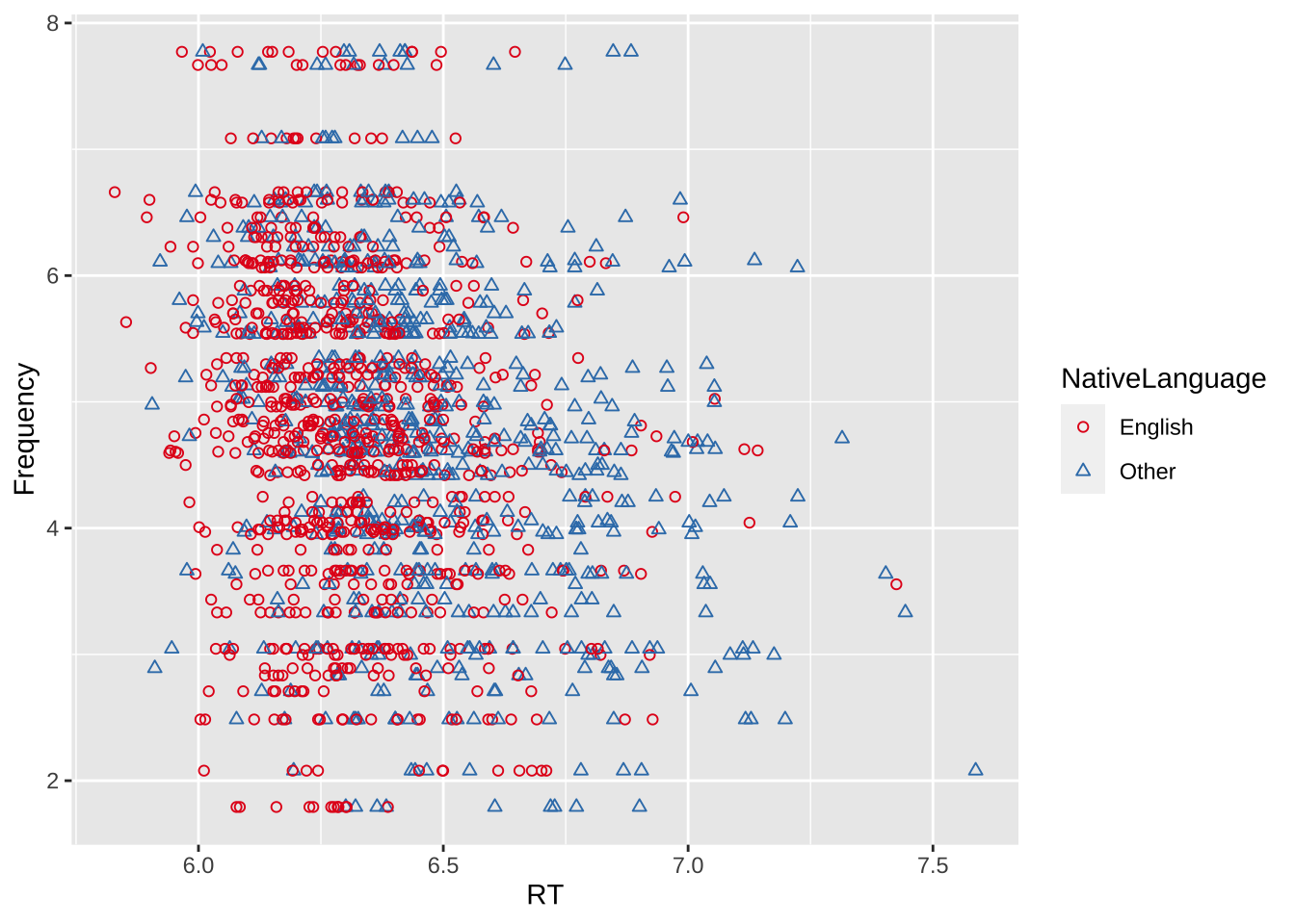
lexdec%>%
  ggplot(., aes(x = RT, y = Frequency,
                shape = NativeLanguage, colour = FamilySize)) +
geom_point() 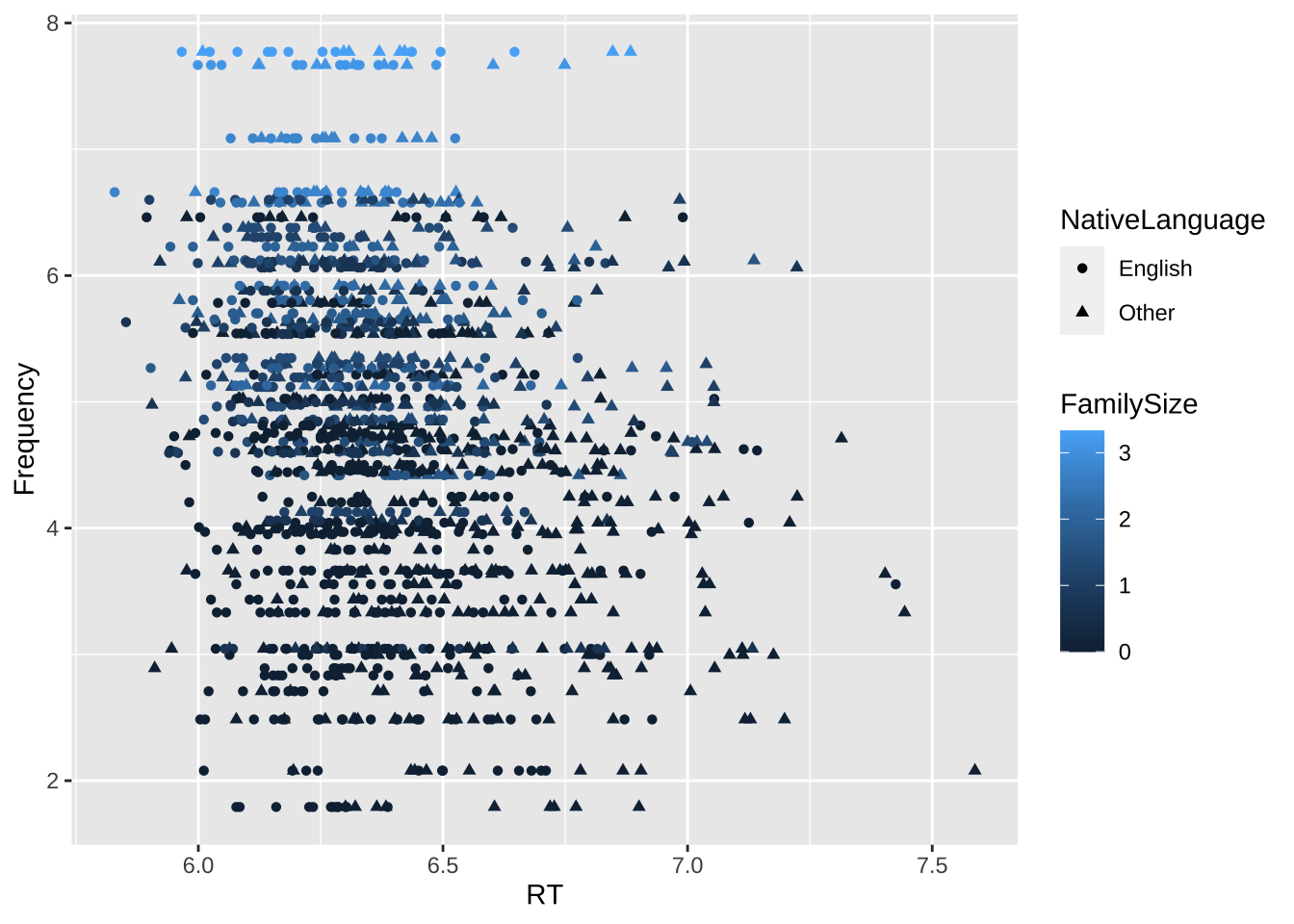
lex.scatter.plt+
  geom_point(colour = "grey60") +
  stat_smooth(method = lm, se = FALSE, colour = "black")
## `geom_smooth()` using formula = 'y ~ x'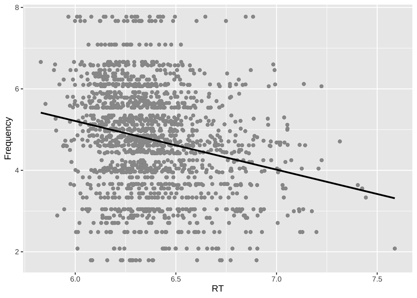
## `geom_smooth()` using formula = 'y ~ x'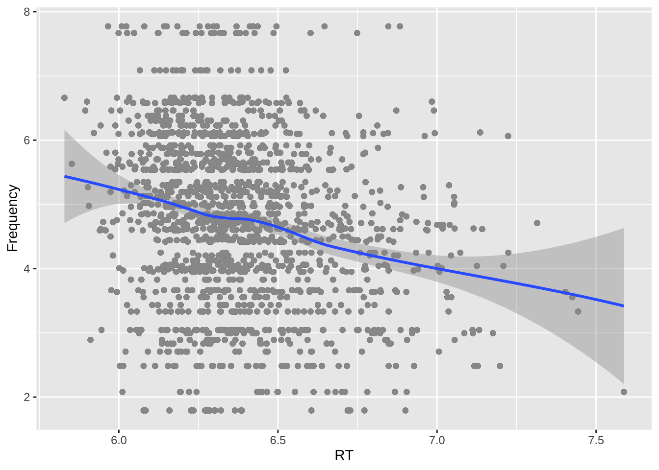
lexdec%>%
  ggplot(., aes(x = RT, y = Frequency,  colour = NativeLanguage)) +
    geom_point() +
    scale_colour_brewer(palette = "Set1")+
  geom_smooth()
## `geom_smooth()` using method = 'loess' and formula = 'y ~ x'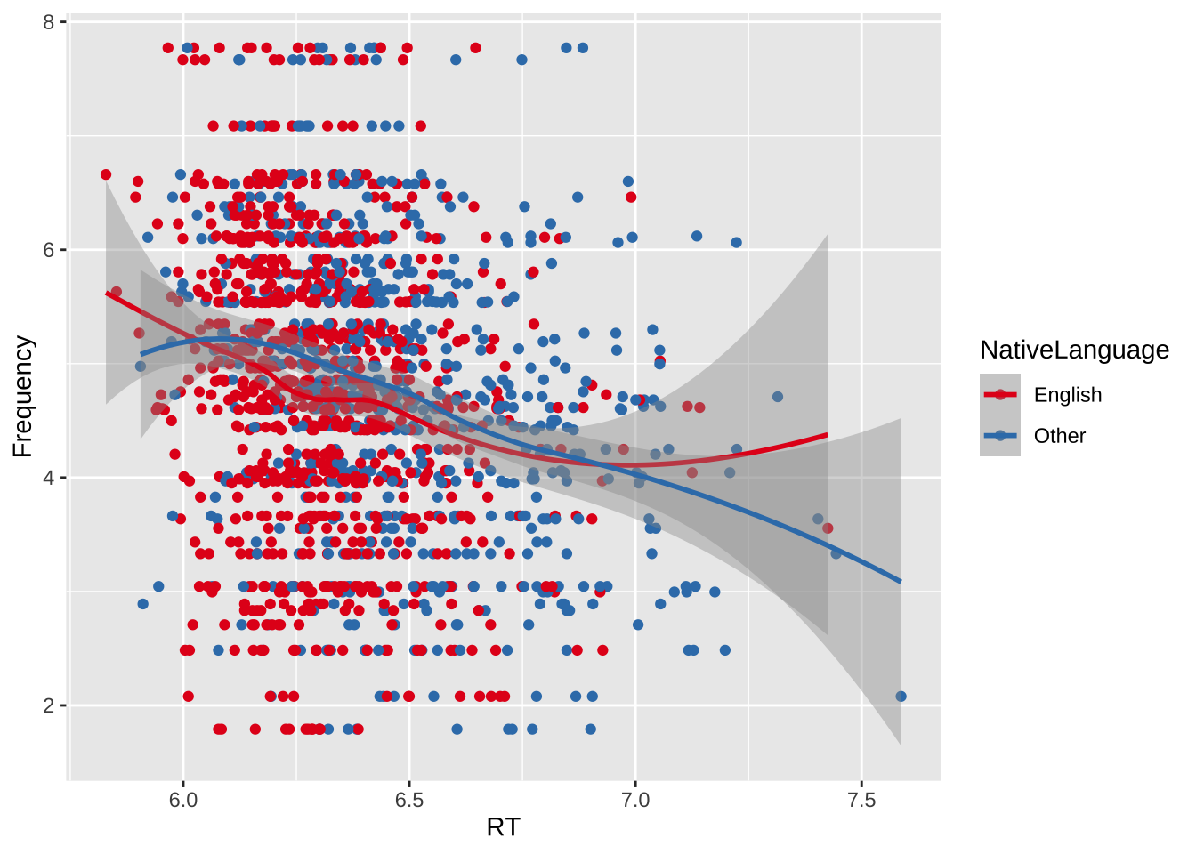
15.5 脑区图
# Enable this universe
options(repos = c(
  ggseg = 'https://ggseg.r-universe.dev',
  CRAN = 'https://cloud.r-project.org'))


setwd("~/Nutstore Files/115_JournalPaper/7_aphasiaBankLexical")
fig = "/Users/chenjuqiang/Nutstore Files/115_JournalPaper/7_aphasiaBankLexical/data/figure/"

# Install some packages
#install.packages('ggsegBrodmann')

library(ggseg)

#> Warning: package 'ggseg' was built under R version 4.1.1
#> Loading required package: ggplot2
library(ggseg3d)
library(ggsegBrodmann)

dk
## # dk cortical brain atlas
## regions: 35
## hemispheres: left, right
## side views: lateral, medial
## palette: yes
## use: ggplot() + geom_brain()
## ----
## hemi side region label roi
## <chr> <chr> <chr> <chr> <chr>
## 1 left lateral bankssts lh_bankssts 0002
## 2 left lateral caudal middle frontal lh_caudalmiddlefrontal 0004
## 3 left lateral fusiform lh_fusiform 0008
## 4 left lateral inferior parietal lh_inferiorparietal 0009
## 5 left lateral inferior temporal lh_inferiortemporal 0010
## 6 left lateral lateral occipital lh_lateraloccipital 0012
## 7 left lateral lateral orbitofrontal lh_lateralorbitofrontal 0013
## 8 left lateral middle temporal lh_middletemporal 0016
## 9 left lateral pars opercularis lh_parsopercularis 0019
## 10 left lateral pars orbitalis lh_parsorbitalis 0020
## # ℹ 76 more rows
# Figure 3

ggseg(mapping = aes(fill = region), colour="black") +
  scale_fill_brain("dk") +
  theme(legend.justification = c(1,0),
        legend.position = "bottom",
        legend.text = element_text(size = 5)) +
  guides(fill = guide_legend(ncol = 3))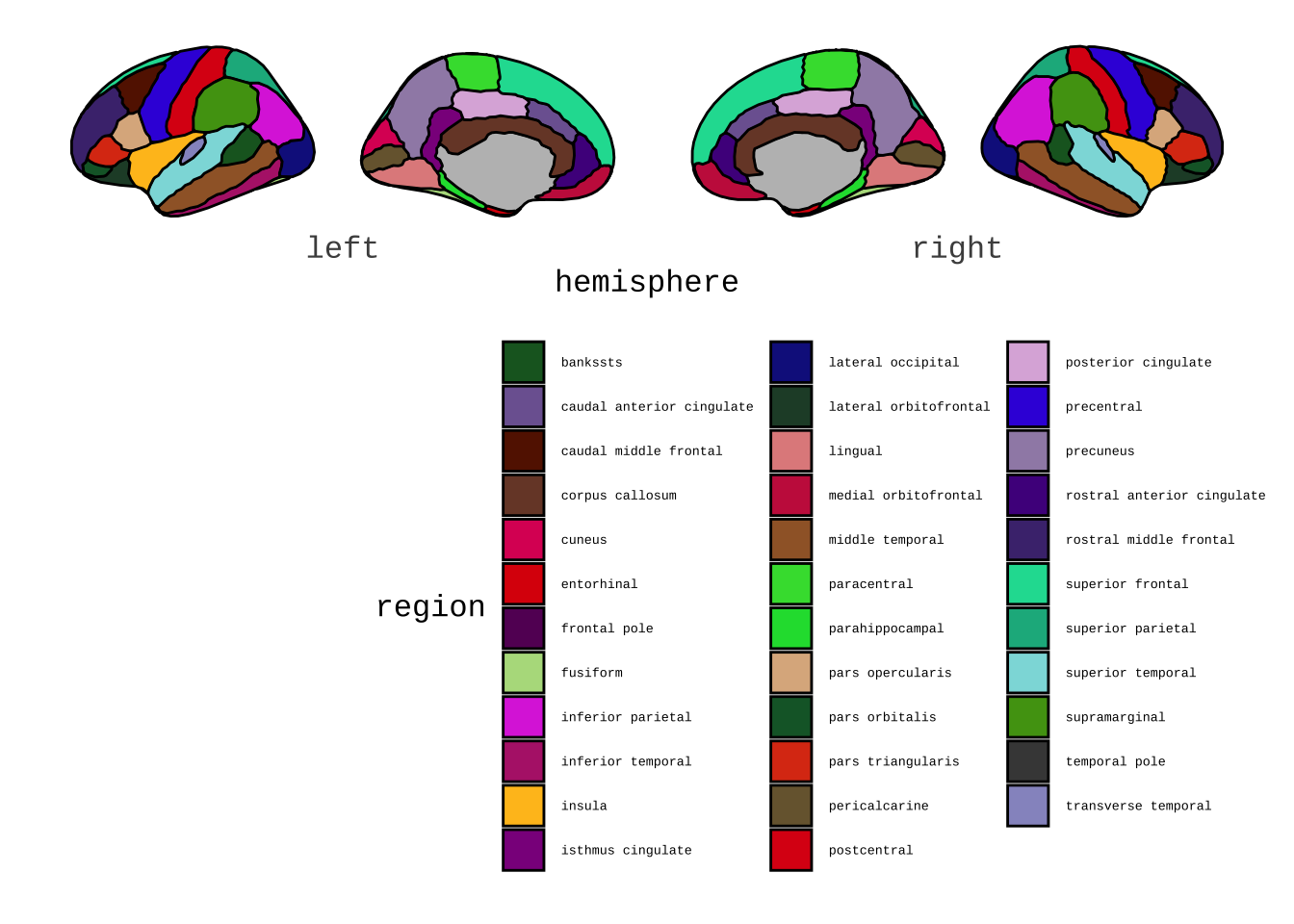
ggseg(view = "medial",mapping = aes(fill = region), colour="black") +
  scale_fill_brain("dk") +
  theme(legend.justification = c(1,0),
        legend.position = "bottom",
        legend.text = element_text(size = 5)) +
  guides(fill = guide_legend(ncol = 3))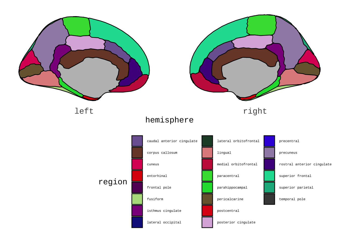
ggseg(hemisphere = "left",mapping = aes(fill = region), colour="black") +
  scale_fill_brain("dk") +
  theme(legend.justification = c(1,0),
        legend.position = "bottom",
        legend.text = element_text(size = 5)) +
  guides(fill = guide_legend(ncol = 3))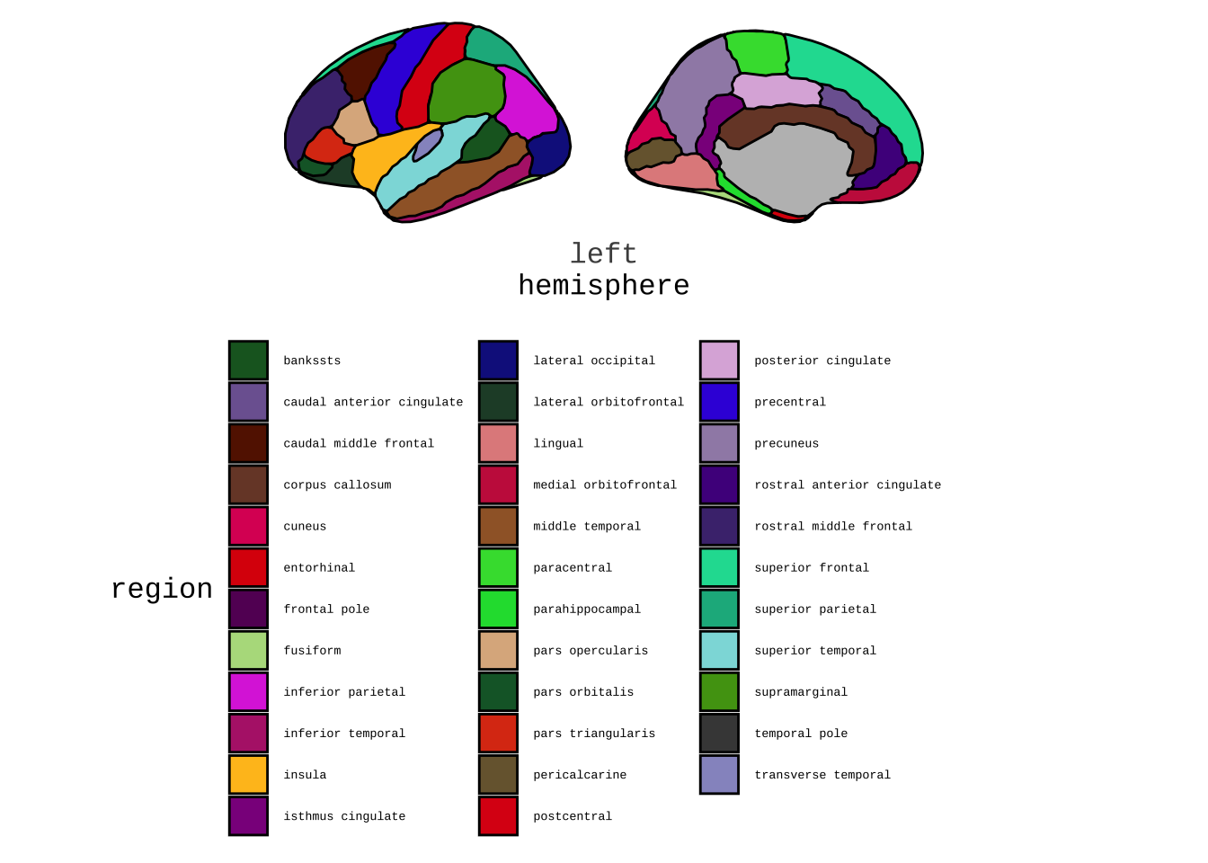
ggseg (atlas = "aseg", mapping = aes(fill = region)) +
  theme(legend.justification = c(1, 0),
        legend.position = "bottom" ,
        legend.text = element_text(size = 5)) +
  guides(fill = guide_legend(ncol = 3))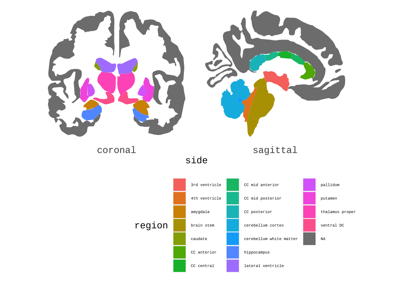
plot(brodmann) +
  theme(legend.position = "bottom",
        legend.text = element_text(size = 9)) +
  guides(fill = guide_legend(ncol = 6))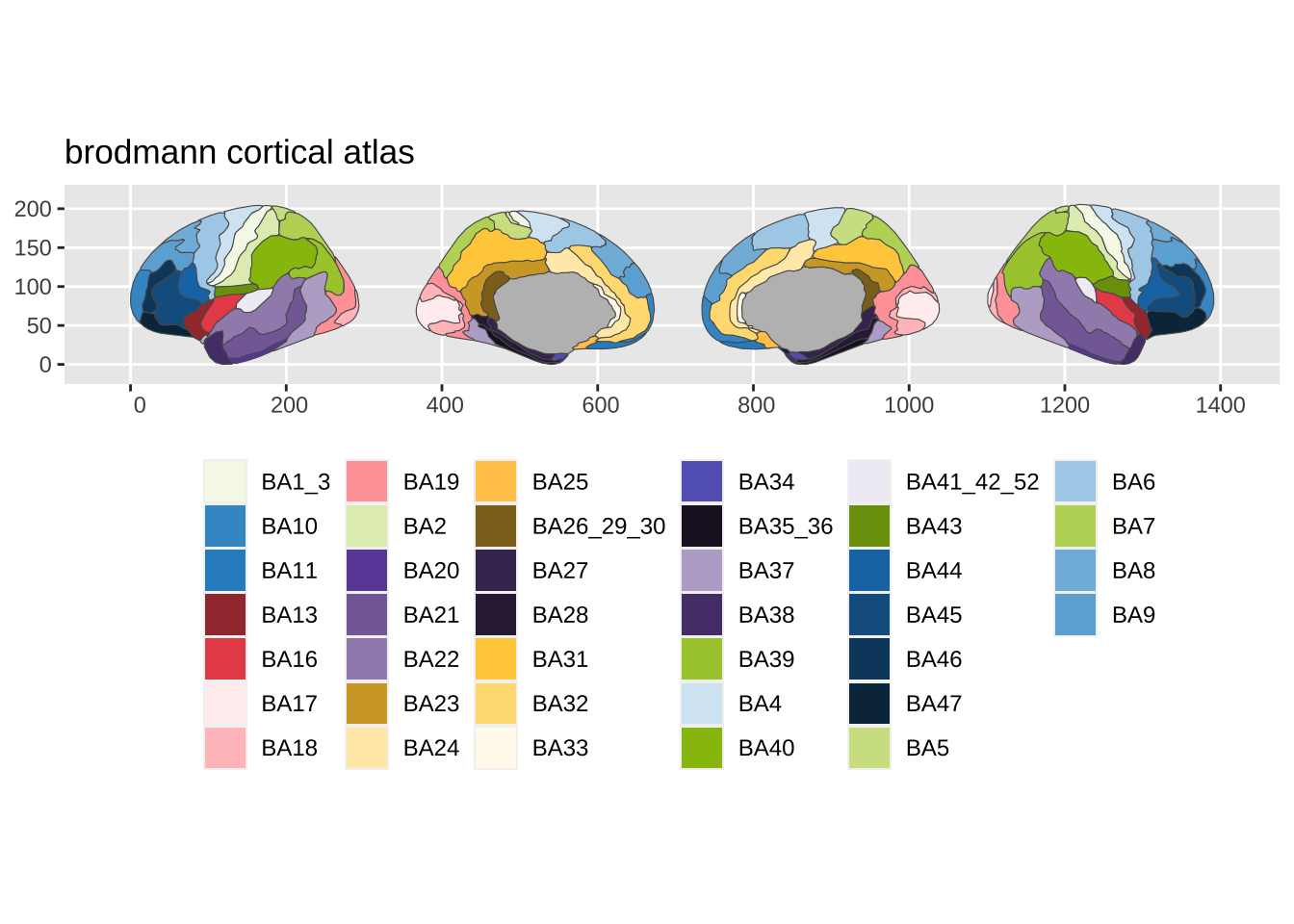
15.6 Venn图
library(eulerr)
library(showtext)

# font_install(source_han_serif())
# font_families()
showtext_auto()

ds_venn <- euler(c("A" = 10, "B" = 10, "C" = 10,
                                 "A&B" = 4, "A&C" = 4, "B&C" = 4,
                                 "A&B&C" = 2))
plot(ds_venn,
     labels = c("Computer programming", "Statistics", "Domain knowledge",
                     "Machine learning", "Traditional research","Danger zone",
                     "Data Science"))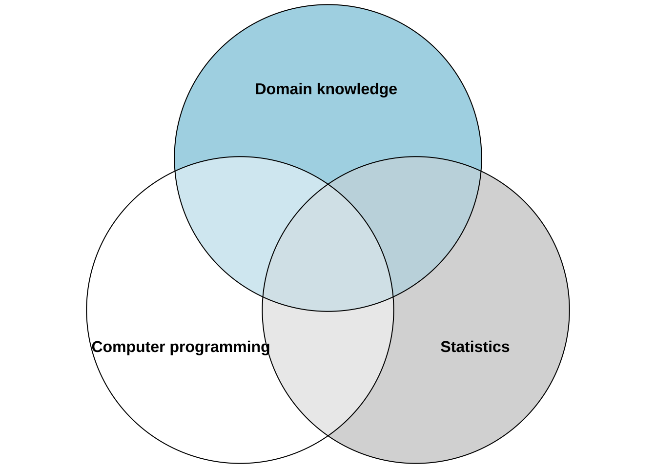
# font_files()
# font_add("Songti SC", "Songti.ttc")


ds_venn_chinese <- euler(c("A" = 10, "B" = 10, "C" = 10,
                   "A&B" = 4, "A&C" = 4, "B&C" = 4,
                   "A&B&C" = 2))

plot(ds_venn_chinese,
     labels = c("计算机编程", "统计", "专业知识",
                "Machine learning", "Traditional research","Danger zone",
                "Data Science"))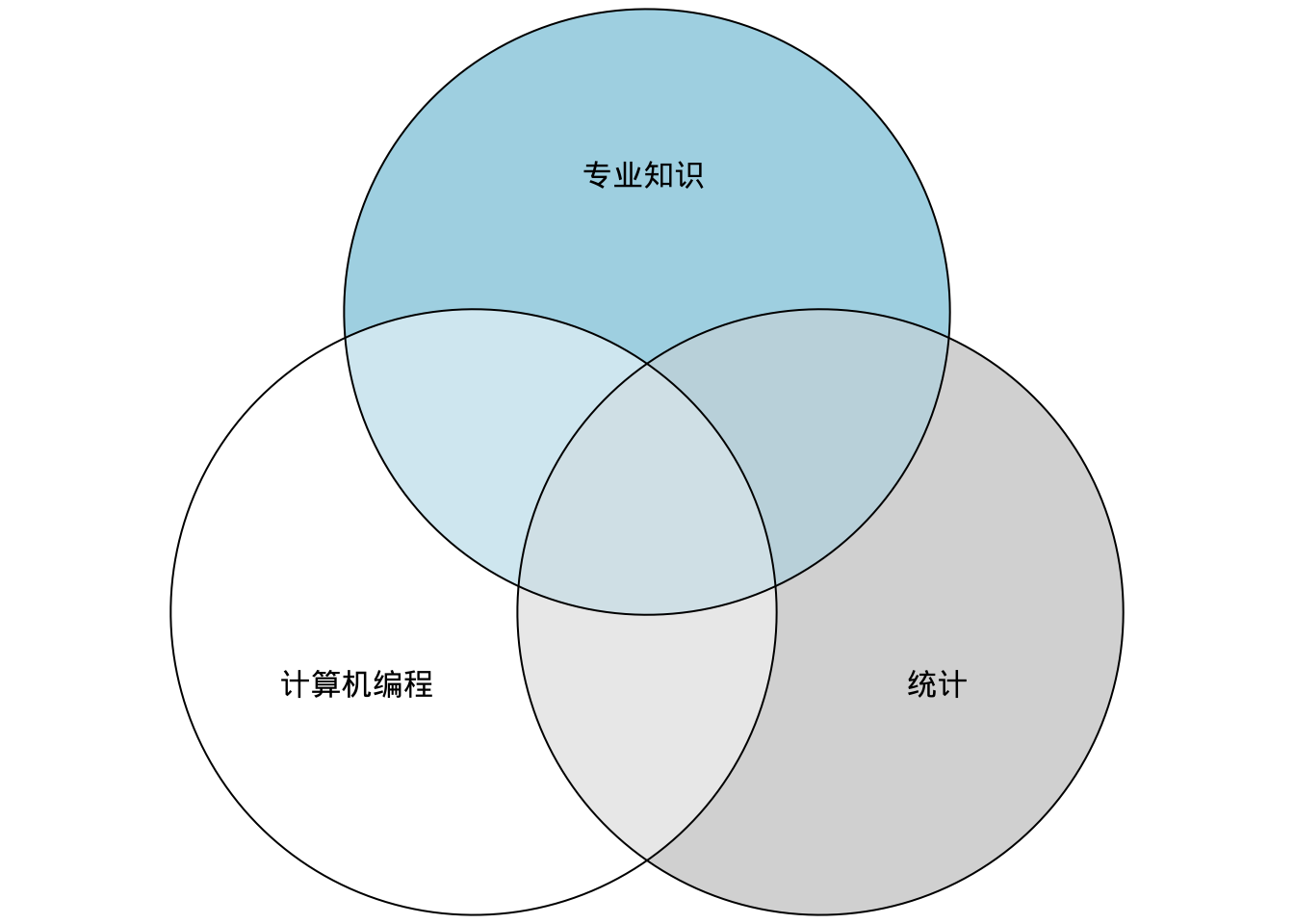
15.7 diagram
library(DiagrammeR)

grViz("
digraph data_wrangling_workflow {

  # a 'graph' statement
  graph [overlap = true,
        fontsize = 10,
        rankdir = LR]

  # several 'node' statements
  node [shape = box,
        style = unfilled,
        fontname = Helvetica]
  导入; 整理;  展示

  node [shape = circle,
        style = filled,
        fontname = Helvetica]
   转化; 可视化; 建模;
  # several 'edge' statements
导入 -> 整理->转化
转化 -> 可视化
建模 -> 转化
可视化->建模
建模->展示
#Communicate -> Model
#Communicate -> Visualize
#Model -> Communicate[dir = both]
#Visualize -> Communicate [dir = both]
}
")
# figure 1.2b
grViz("
digraph data_wrangling_workflow {
# a 'graph' statement
graph [overlap = true,
fontsize = 10,
rankdir = LR,
nodesep = 0.2]
# several 'node' statements
node [shape = box,
style = unfilled,
fontname = Helvetica]
问题设计;理解数据;提取特征;建模分析;结果呈现;代码部署
# several 'edge' statements
问题设计 -> 理解数据 -> 提取特征 -> 建模分析
建模分析 -> 结果呈现
建模分析 -> 代码部署
建模分析 -> 问题设计
}
")grViz("
digraph data_wrangling_workflow {
# a 'graph' statement
graph [overlap = true,
fontsize = 10,
rankdir = LR,
nodesep = 0.2]
# several 'node' statements
node [shape = box,
style = unfilled,
fontname = Helvetica]
# several 'edge' statements
研究目的设定 -> 提取数据 -> 数据准备 -> 数据探索->数据建模->呈现及自动化
提取数据 -> 内部数据
提取数据 -> 外部数据
}
")grViz("
digraph data_wrangling_workflow {
# a 'graph' statement
graph [layout = neato,
overlap = false,
fontsize = 10,
rankdir = LR]
# several 'node' statements
node [shape = oval,
style = unfilled,
fontname = Helvetica,
#fixedsize = true,
width = 1.5]
提出期望
# several 'edge' statements
提出期望 -> 收集数据 -> 对比期望->提出期望
设定问题-> 探索分析->数据建模->模型解读 -> 成果交流 -> 设定问题
收集数据 -> 设定问题[dir = both]
}
")grViz("
digraph data_wrangling_workflow {
# a 'graph' statement
graph [layout = neato,
overlap = false,
fontsize = 10,
rankdir = LR]
# several 'node' statements
node [shape = oval,
style = unfilled,
fontname = Helvetica,
#fixedsize = true,
width = 1.5]
# several 'edge' statements
语言研究-> 语料库语言学
语言研究-> 量化语言学
语言研究-> 计算语言学
语言研究-> 计算文体学
语言研究-> 实验语音学
语言研究-> 心理语言学
}
")grViz("
digraph data_wrangling_workflow {
# a 'graph' statement
graph [layout = neato,
overlap = false,
fontsize = 10,
rankdir = LR]
# several 'node' statements
node [shape = oval,
style = unfilled,
fontname = Helvetica,
#fixedsize = true,
width = 1.5]
# several 'edge' statements
tidyverse-> dplyr数据转化
tidyverse-> tidyr数据清理
tidyverse-> readr数据导入
tidyverse-> ggplot2数据可视化
tidyverse-> purrr功能性编程
tidyverse-> stringr文本处理
tidyverse-> tibble数据框
}
")15.8 Gant plot
library("plan")

g <- new("gantt")
g <- ganttAddTask(g, "Courses") # no times, so a heading
g <- ganttAddTask(g, "Linguistics", "2020-09-03", "2020-12-05", done=100)
g <- ganttAddTask(g, "Experimental design (B)", "2020-09-03", "2020-12-05", done=100)
g <- ganttAddTask(g, "Phonetics", "2020-09-03", "2020-12-05", done=100)
g <- ganttAddTask(g, "Phonology", "2021-01-03", "2021-04-05")
g <- ganttAddTask(g, "Cognitive Science", "2021-01-03", "2021-04-05")
g <- ganttAddTask(g, "Time-series Analysis", "2021-01-03", "2021-04-05")
g <- ganttAddTask(g, "Research") # no times, so a heading
g <- ganttAddTask(g, "Literature review", "2020-09-03", "2021-02-01", done=20)
g <- ganttAddTask(g, "Develop analysis skills", "2020-09-03", "2021-08-01", done=30)
g <- ganttAddTask(g, "Thesis work", "2020-10-01", "2021-07-15", done=30)
g <- ganttAddTask(g, "Thesis proposal", "2020-09-01", "2020-10-01", done = 100)
g <- ganttAddTask(g, "Writing (papers & thesis)", "2021-03-01", "2021-07-15", done = 80)
g <- ganttAddTask(g, "Thesis examination", "2021-09-01", "2021-09-05")


#png("timeline.png", width=15, height=10, res=300, units="in")

plot(g, ylabel=list(font=ifelse(is.na(g[["start"]]), 2, 1)),
     event.time="2021-02-13", event.label="Report Date")

par(lend="square") # default is round

legend("topright", pch=22, cex = 1.5,
       pt.cex=2, pt.bg=gray(c(0.3, 0.9)),bty = "n",
       border="black",
       legend=c("Completed ", "InProgress ") , bg="white")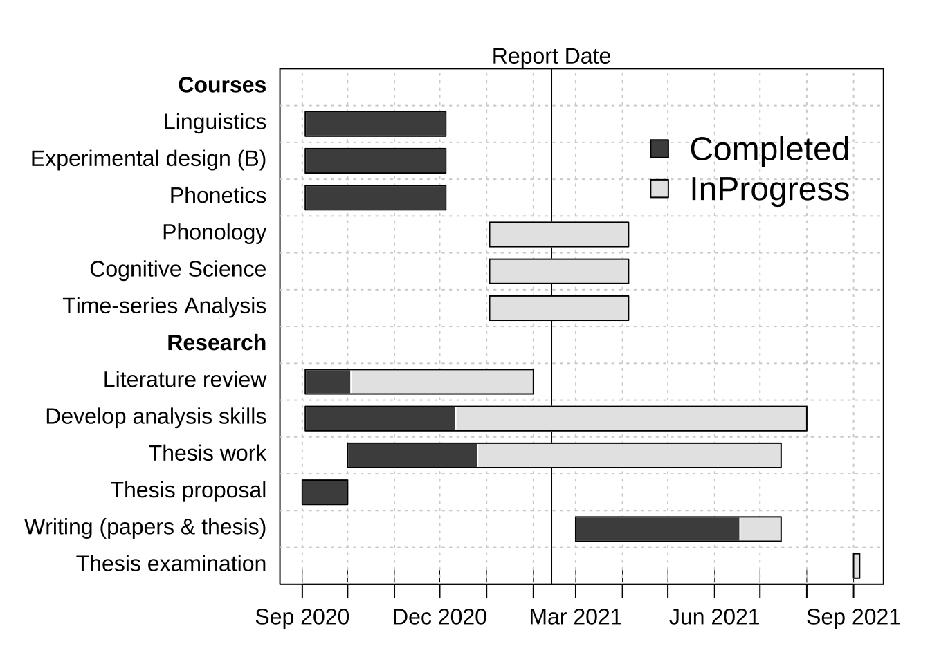
#dev.off()

#各种不同的图例
# legend("topright",
#        #shape
#        pch=22,
#        # size of the text
#        cex = 0.9,
#        #text.width = 12,
#        # inset = c(0, 0.6),
#        # no box border
#        #bty = "n",
#        # size of the icon
#        pt.cex=2,
#        pt.bg=gray(c(0.3, 0.9)),
#        #border="white",
#        legend=c("Completed","In Progress"),
#        #title="MSc plan",
#        bg="white")
#
# ## get corrdinates
# coord <- par("usr")
# legend(x = coord[2] * 0.85, y = coord[4]*0.5,
#        xjust = 0,
#        yjust = 0,
#        #shape
#        pch=22,
#        # size of the text
#        cex = 0.7,
#        #text.width = 12,
#        inset = c(1, 0.5),
#        # no box border
#        #bty = "n",
#        # size of the icon
#        pt.cex=1,
#        pt.bg=gray(c(0.3, 0.9)),
#        #border="white",
#        legend=c("Completed","In Progress"),
#        #title="MSc plan",
#        bg="white")
#
# legend( x= "bottomright", y=100,
#         legend=c("quantile","90st"),
#         col=c("blue", "yellow", ),
#         pch=c(".","."))
#
# legend("topright", y = 1,
#        legend(pch=22,
#               pt.cex= 1,
#               pt.bg=gray(c(0.3, 0.9)),
#               border="black",
#               legend=c("Completed", "Not Yet Done"),
#               bg="white"))
#
# legend(x = data.frame(x = "Courses", y = 2017-09-1),
#        pch=22,
#        pt.cex=2,
#        pt.bg=gray(c(0.3, 0.9)),
#        horiz=TRUE,
#        border="black",
#        legend=c("Completed", "Not Yet Done"),
#        title="Juqiang's plan", bg="white")


# author's reply

# g <- new("gantt")
# g <- ganttAddTask(g, "Courses") # no times, so a heading
# g <- ganttAddTask(g, "Physical Oceanography (A)", "2016-09-03", "2016-12-05", done=100)
# g <- ganttAddTask(g, "Chemistry Oceanography (B)", "2016-09-03", "2016-12-05", done=100)
# g <- ganttAddTask(g, "Fluid Dynamics (A+)", "2016-09-03", "2016-12-05", done=100)
# g <- ganttAddTask(g, "Biological Oceanography", "2017-01-03", "2017-04-05")
# g <- ganttAddTask(g, "Geological Oceanography", "2017-01-03", "2017-04-05")
# g <- ganttAddTask(g, "Time-series Analysis", "2017-01-03", "2017-04-05")
# g <- ganttAddTask(g, "Research") # no times, so a heading
# g <- ganttAddTask(g, "Literature review", "2016-09-03", "2017-02-01", done=20)
# g <- ganttAddTask(g, "Develop analysis skills", "2016-09-03", "2017-08-01", done=30)
# g <- ganttAddTask(g, "Thesis work", "2016-10-01", "2018-07-15", done=30)
# g <- ganttAddTask(g, "Thesis proposal", "2017-05-01", "2017-06-01")
# g <- ganttAddTask(g, "Writing (papers & thesis)", "2017-03-01", "2018-07-15")
# g <- ganttAddTask(g, "Defend thesis", "2018-09-01", "2018-09-05")
#
# plot(g, ylabel=list(font=ifelse(is.na(g[["start"]]), 2, 1)),
#      event.time="2018-08-13", event.label="Report Date")
#
# par(lend="square") # default is round
#
# par(xpd=NA)
# legend(x=0.8, y=1.05,
#        pch=22,
#        pt.cex= 1,
#        pt.bg=gray(c(0.3, 0.9)),
#        border="black",
#        legend=c("Completed", "Not Yet Done"),
#        bg="white")


## ggplot version

library(lubridate)
library(scales)
library(Cairo)

# Alternatively you can put all this in a CSV file with the same columns and
# then load it with read_csv()
# tasks <- read_csv("path/to/the/file")

tasks <- tribble(
        ~Start,       ~End,         ~Project,          ~Task,
        "2015-11-15", "2015-11-20", "Data collection", "Use IssueCrawler to expand lists",
        "2015-11-21", "2015-11-25", "Data collection", "Complete INGO databases",
        "2015-11-16", "2015-12-15", "Data collection", "Find all INGO legislation",
        "2015-12-15", "2015-12-25", "Data collection", "Code INGO restrictions",
        "2015-11-15", "2015-11-25", "Data collection", "Develop general INGO survey",
        "2015-11-25", "2015-12-31", "Data collection", "Administer survey",
        "2015-12-25", "2015-12-31", "Data analysis",   "Model stability and restrictions",
        "2016-01-01", "2016-02-02", "Writing",         "Chapter on formal restrictions (H1)",
        "2016-01-15", "2016-02-15", "Writing",         "Paper or chapter on survey results (H3 and H4)",
        "2016-03-16", "2016-03-19", "Writing",         "ISA conference in Atlanta",
        "2016-02-01", "2016-03-01", "Data collection", "Historical INGO restrictions in China",
        "2016-02-01", "2016-03-01", "Data collection", "Historical INGO restrictions in Egypt",
        "2016-05-01", "2016-06-01", "Data collection", "Fieldwork in London and Beijing",
        "2016-03-01", "2016-04-01", "Data analysis",   "Analyze restrictions in China and Egypt",
        "2016-04-01", "2016-06-01", "Data analysis",   "Analyze INGO activities",
        "2016-04-01", "2016-06-15", "Writing",         "Chapter on application of restrictions (H2)",
        "2016-05-01", "2016-07-01", "Writing",         "Chapter on INGO ideal points (H3)",
        "2016-05-01", "2016-07-01", "Writing",         "Chapter on INGO flexibility (H4)",
        "2016-07-01", "2016-08-01", "Writing",         "Theory",
        "2016-08-01", "2016-09-15", "Writing",         "Conclusion",
        "2016-08-01", "2016-09-15", "Writing",         "Introduction"
)

# Convert data to long for ggplot
tasks.long <- tasks %>%
        mutate(Start = ymd(Start),
               End = ymd(End)) %>%
        gather(date.type, task.date, -c(Project, Task)) %>%
        arrange(date.type, task.date) %>%
        mutate(Task = factor(Task, levels=rev(unique(Task)), ordered=TRUE))

# Custom theme for making a clean Gantt chart
theme_gantt <- function(base_size=11 ) {
        ret <- theme_bw(base_size) %+replace%
                theme(panel.background = element_rect(fill="#ffffff", colour=NA),
                      axis.title.x=element_text(vjust=-0.2),
                      axis.title.y=element_text(vjust=1.5),
                      title=element_text(vjust=1.2),
                      panel.border = element_blank(), axis.line=element_blank(),
                      panel.grid.minor=element_blank(),
                      panel.grid.major.y = element_blank(),
                      panel.grid.major.x = element_line(size=0.5, colour="grey80"),
                      axis.ticks=element_blank(),
                      legend.position="bottom",
                      axis.title=element_text(size=rel(0.8) ),
                      strip.text=element_text(size=rel(1)),
                      strip.background=element_rect(fill="#ffffff", colour=NA),
                      panel.spacing.y=unit(1.5, "lines"),
                      legend.key = element_blank())

        ret
}

# Calculate where to put the dotted lines that show up every three entries
x.breaks <- seq(length(tasks$Task) + 0.5 - 3, 0, by=-3)

# Build plot
timeline <- ggplot(tasks.long, aes(x=Task, y=task.date, colour=Project)) +
        geom_line(size=6) +
        geom_vline(xintercept=x.breaks, colour="grey80", linetype="dotted") +
        guides(colour=guide_legend(title=NULL)) +
        labs(x=NULL, y=NULL) + coord_flip() +
        scale_y_date(date_breaks="2 months", labels=date_format("%b ‘%y")) +
        theme_gantt() + theme(axis.text.x=element_text(angle=45, hjust=1))

timeline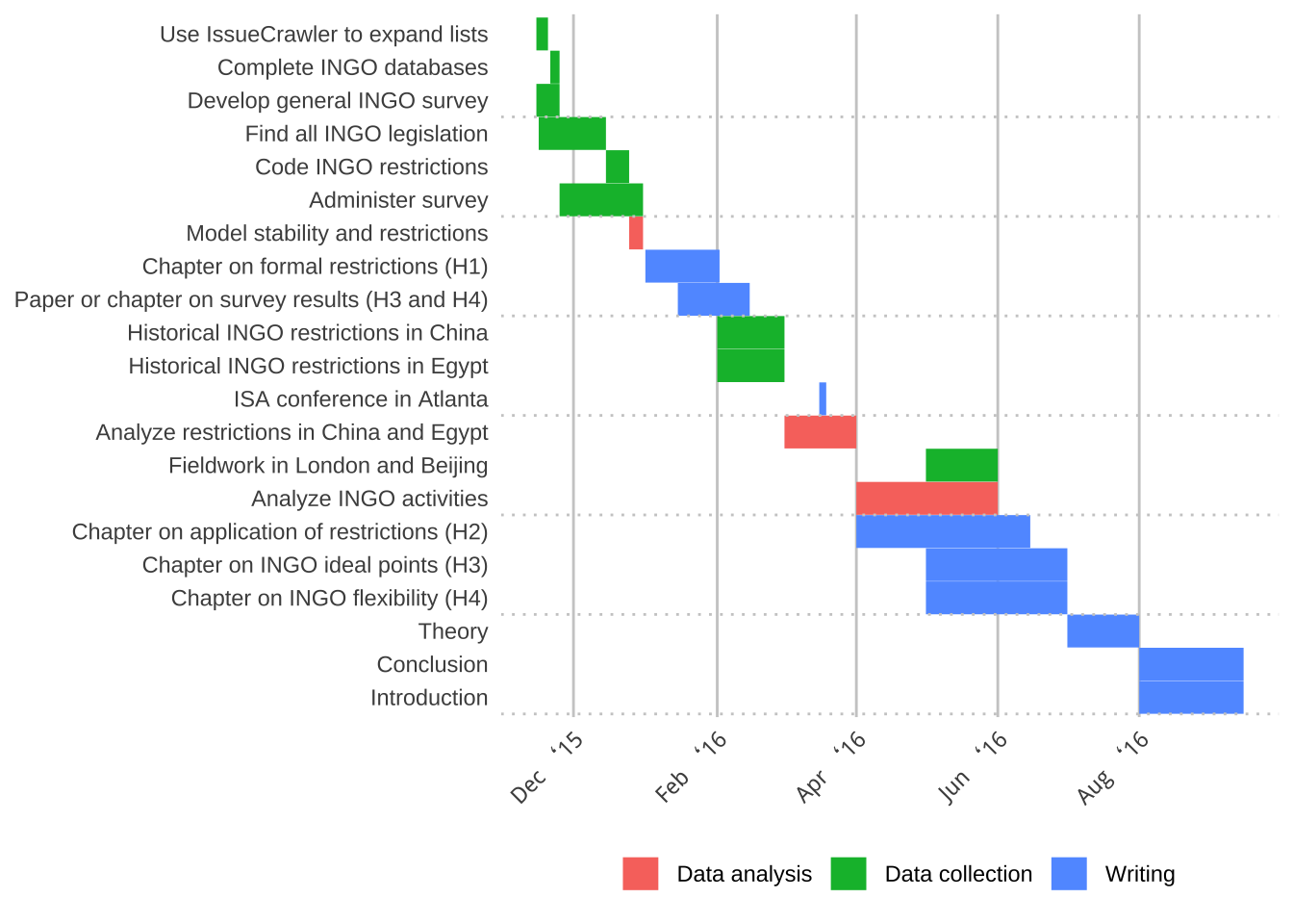
15.9 图标Lengends
15.9.1 图标整体
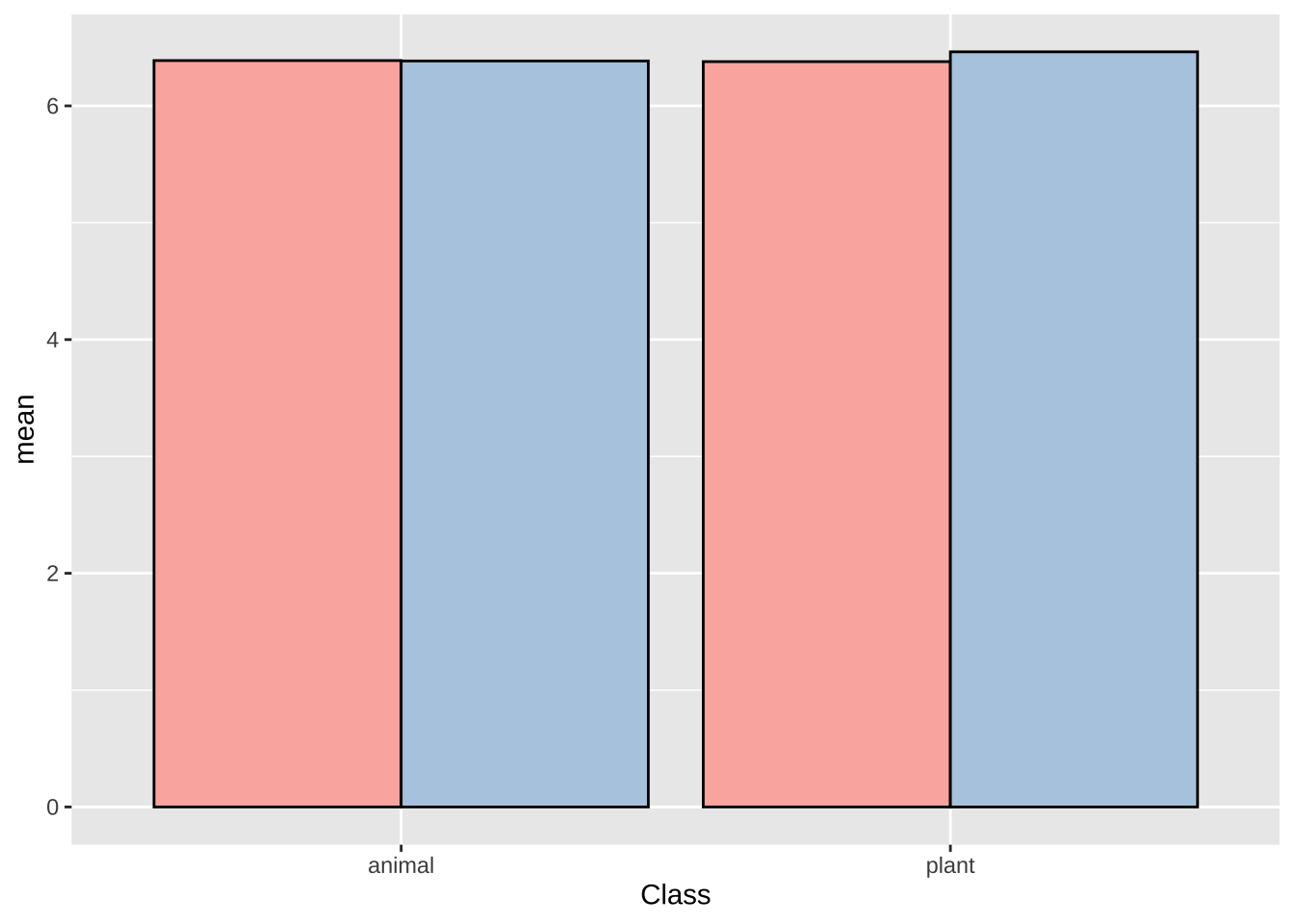
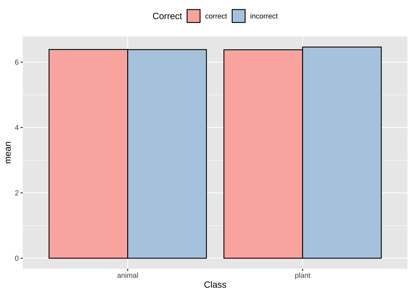
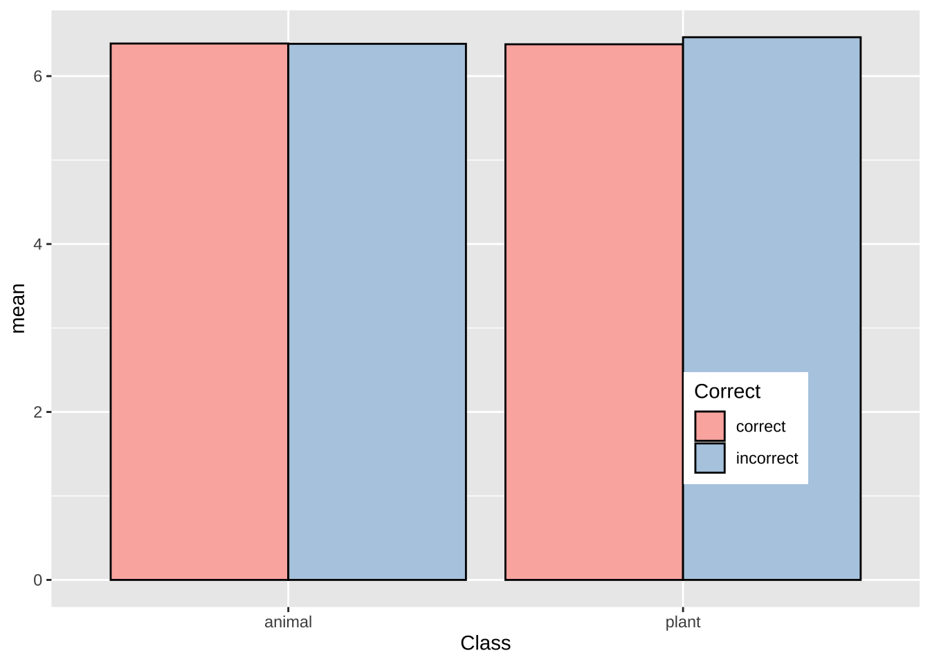
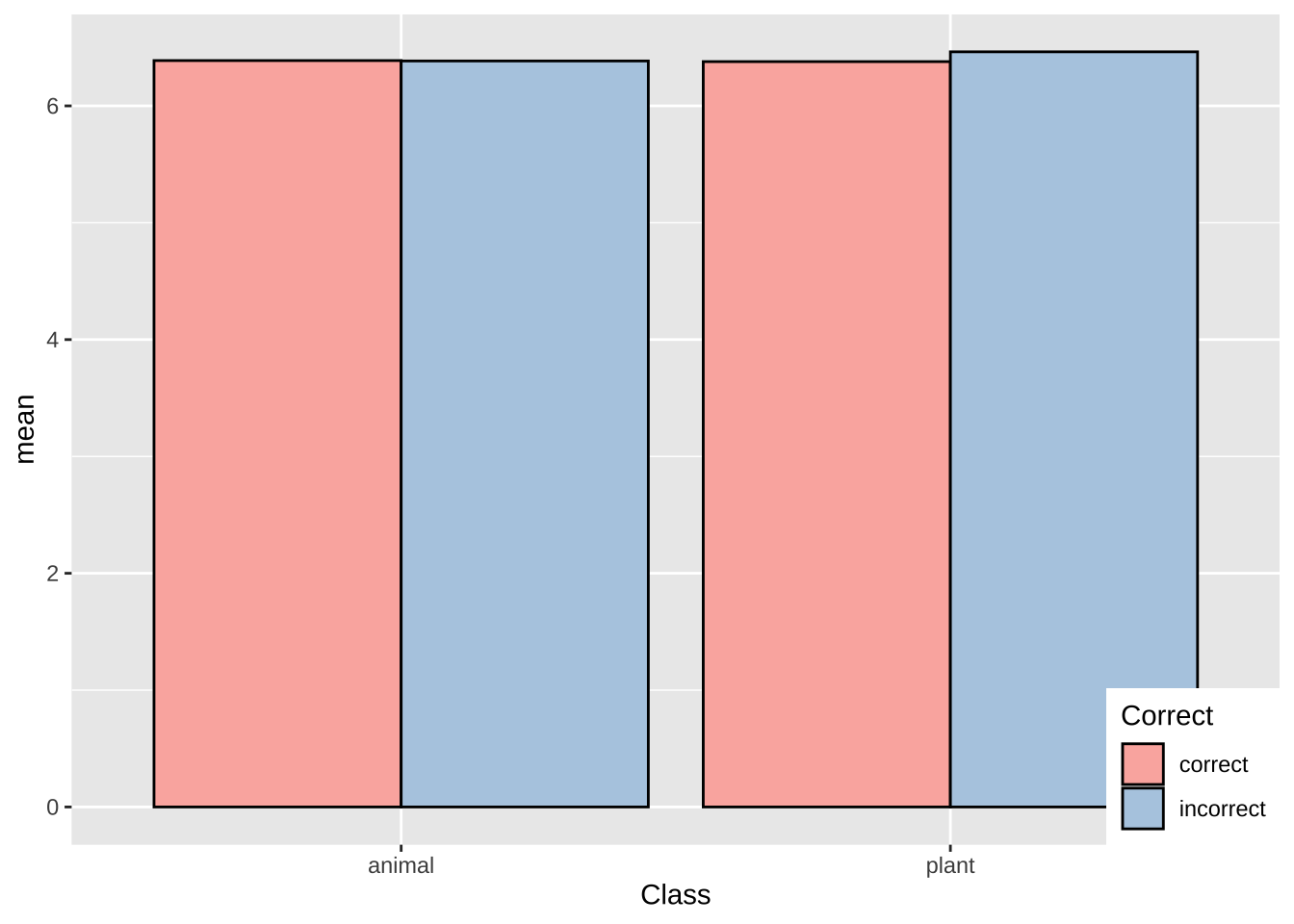
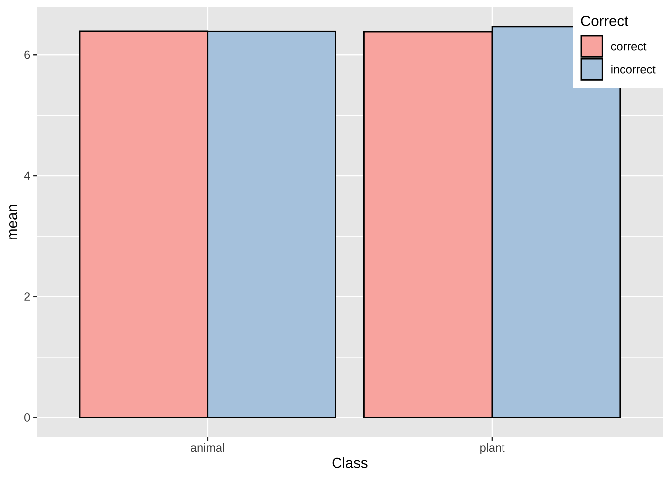
lexdec.plt +
  theme(legend.position = c(.85, .2)) +
  theme(legend.background = element_rect(fill = "white",
                                         colour = "black"))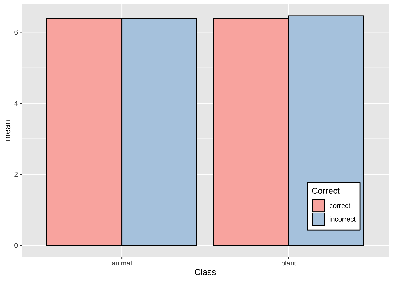
lexdec.plt +
  theme(legend.position = c(.85, .2)) +
  theme(legend.background = element_blank()) +  # Remove overall border
  theme(legend.key = element_blank())           # Remove border around each item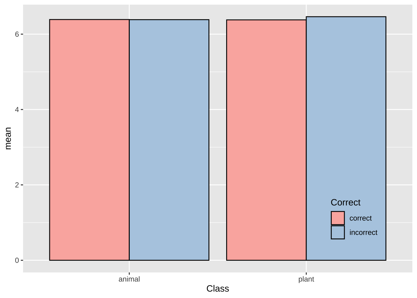
15.9.2 图标标题
# show chinese characters in ggplot
library(showtext)
showtext_auto()
# 改变图例标题内容
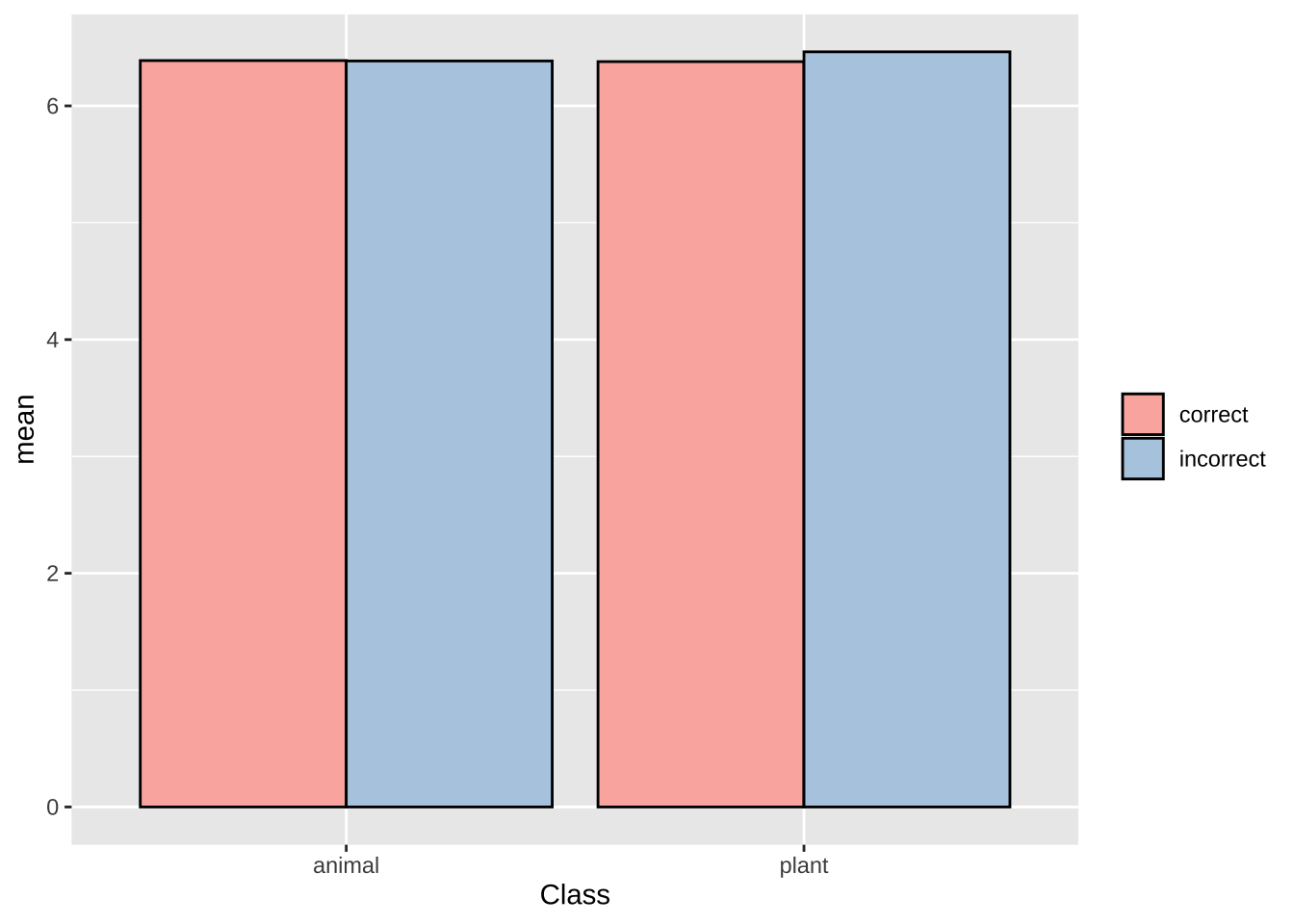
lexdec.plt +labs(fill = "是否\n正确")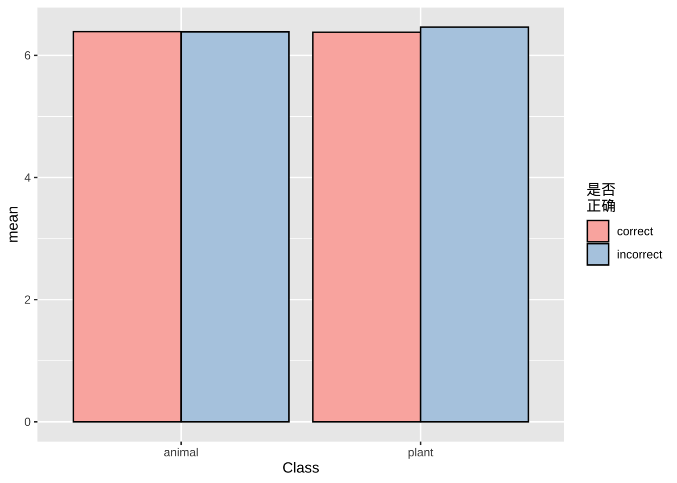
# 改变图例标题风格
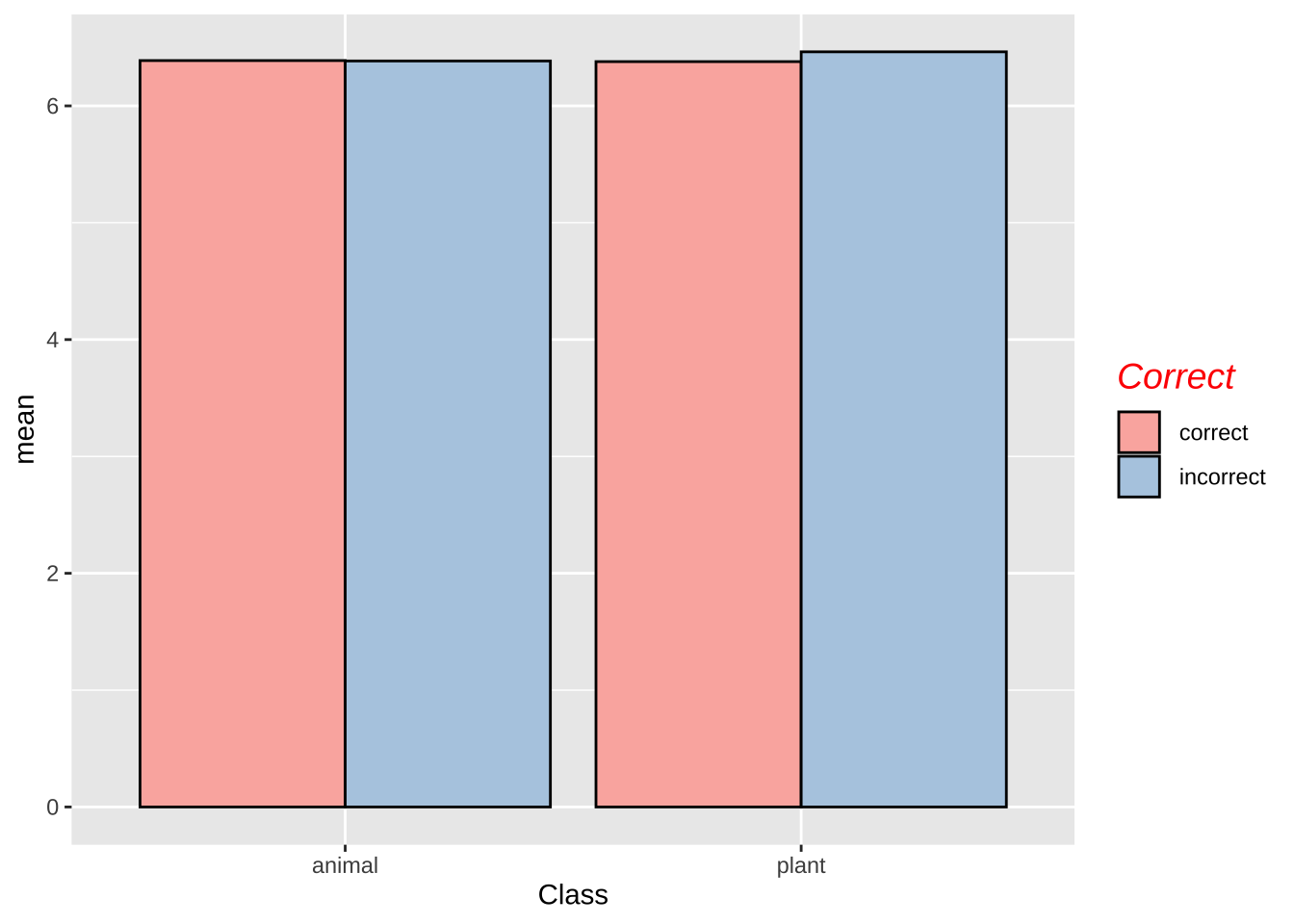
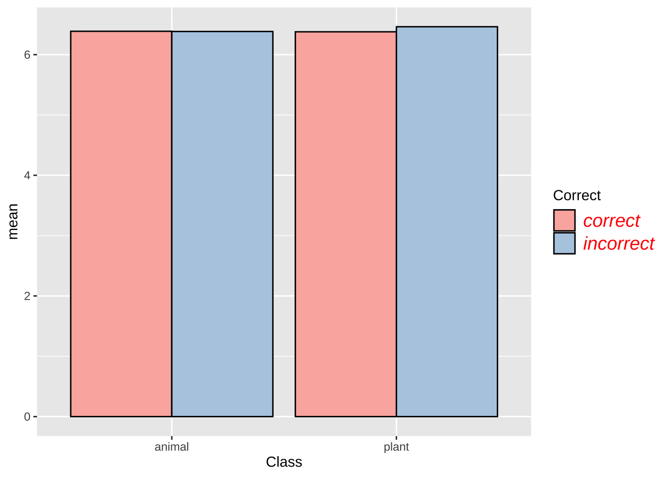
lexdec.plt +
theme(legend.title = element_text(
    face = "italic",
    #family = "Times",
    colour = "red",
    size = 14)
  )
15.9.3 图例标识
lexdec.plt +
  scale_fill_discrete(
    ## 改变顺序
    limits = c("incorrect", "correct"),
    # 改变内容
    labels = c("错误", "正确")
  )
## Scale for fill is already present.
## Adding another scale for fill, which will replace the existing scale.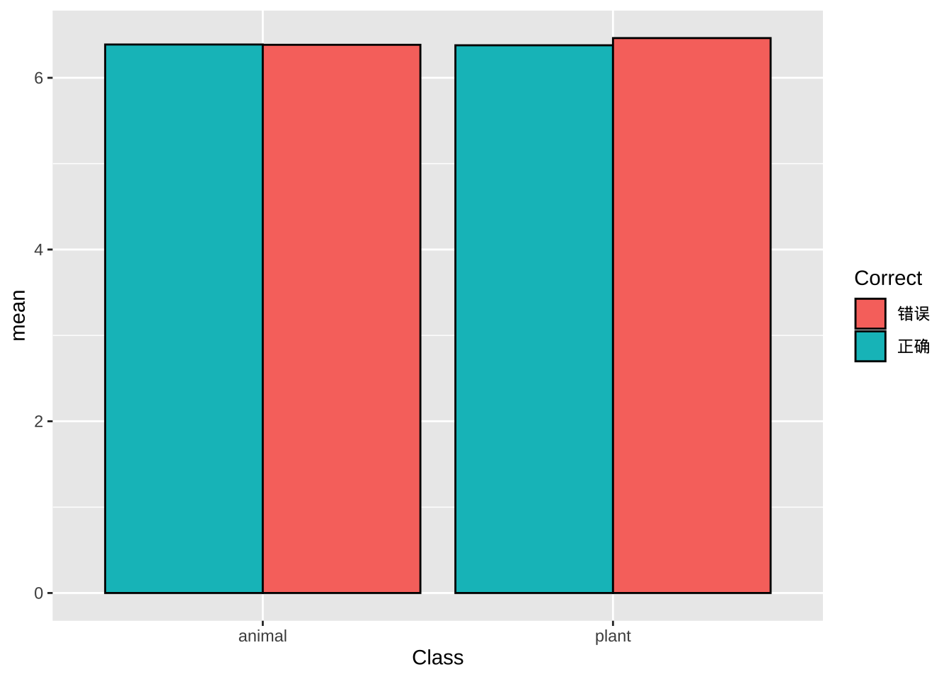
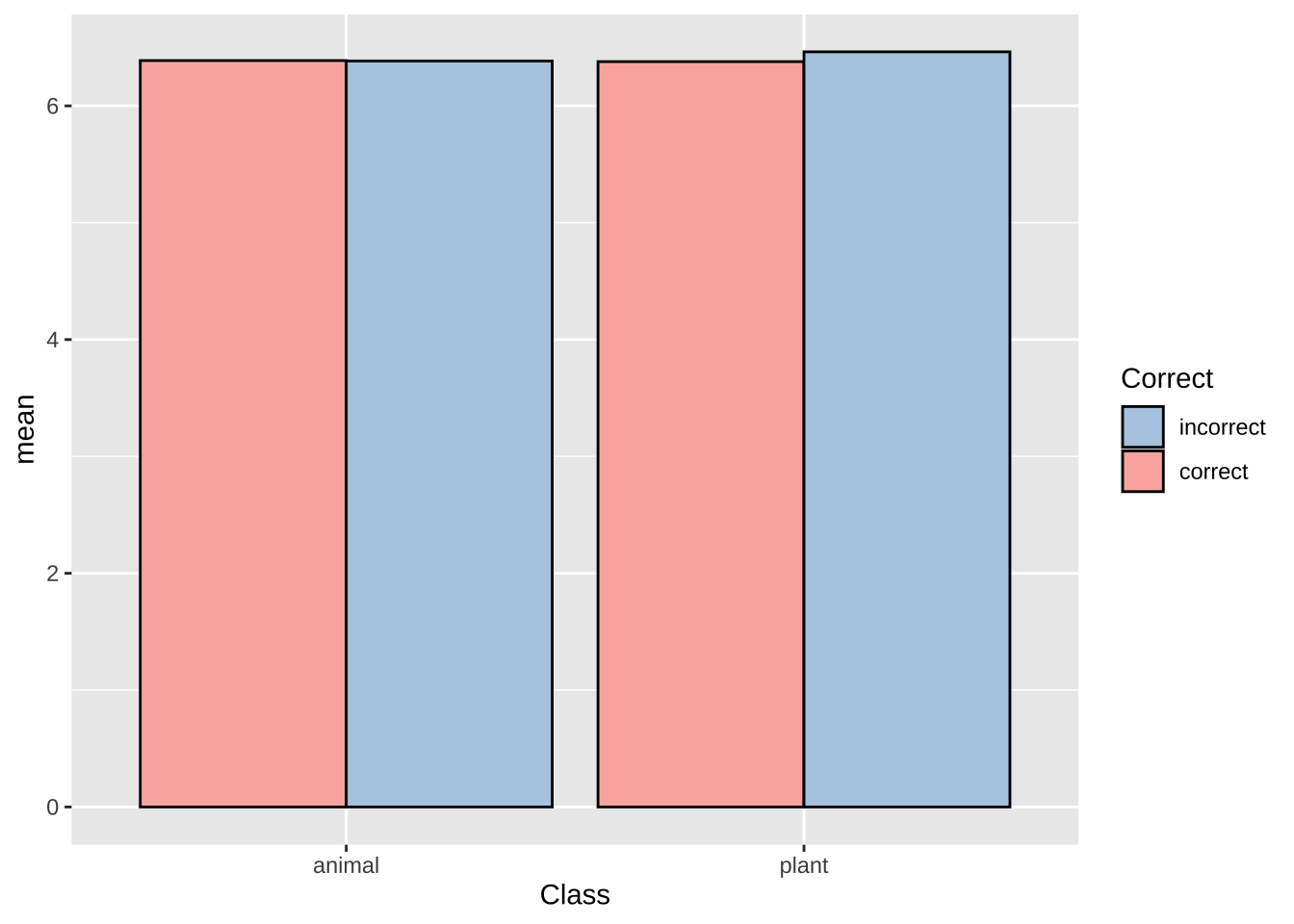
lexdec.plt +
  theme(legend.text = element_text(
    face = "italic",
    family = "sans",
    colour = "red",
    size = 14)
  )
15.10 坐标轴
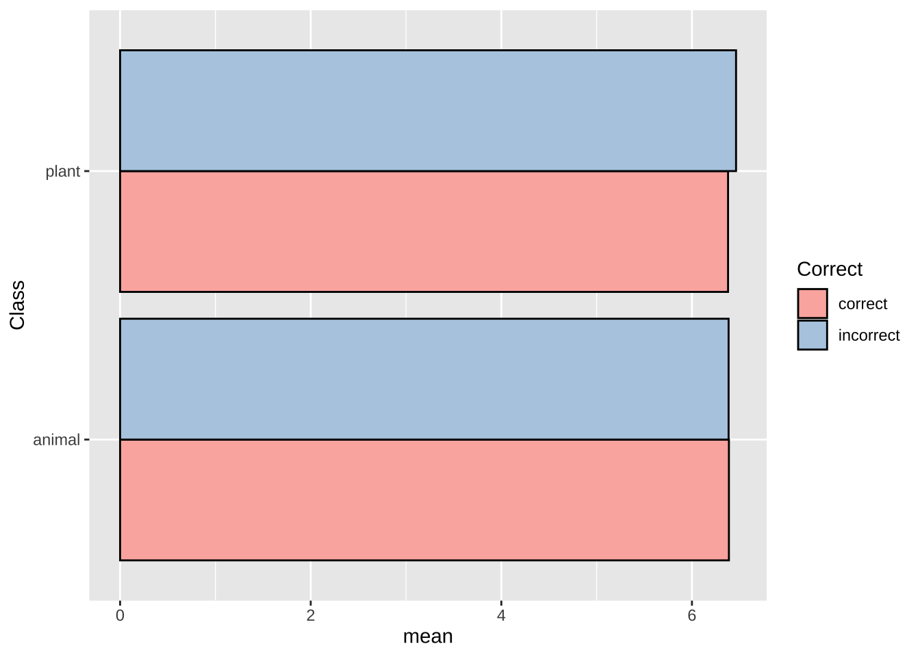
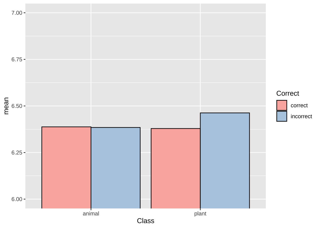
# lexdec%>%
#   group_by(Class, Correct)%>%
#   summarise(mean = mean(RT))%>%
#   ggplot(aes(Class, mean, fill = Correct))+
#   geom_bar(aes(Class, mean, fill = Correct))+
#   #geom_col(position = "dodge", colour = "black") +
#   scale_fill_brewer(palette = "Pastel1")+
#    ylim(4, 7)
#

# 连续坐标顺序调整

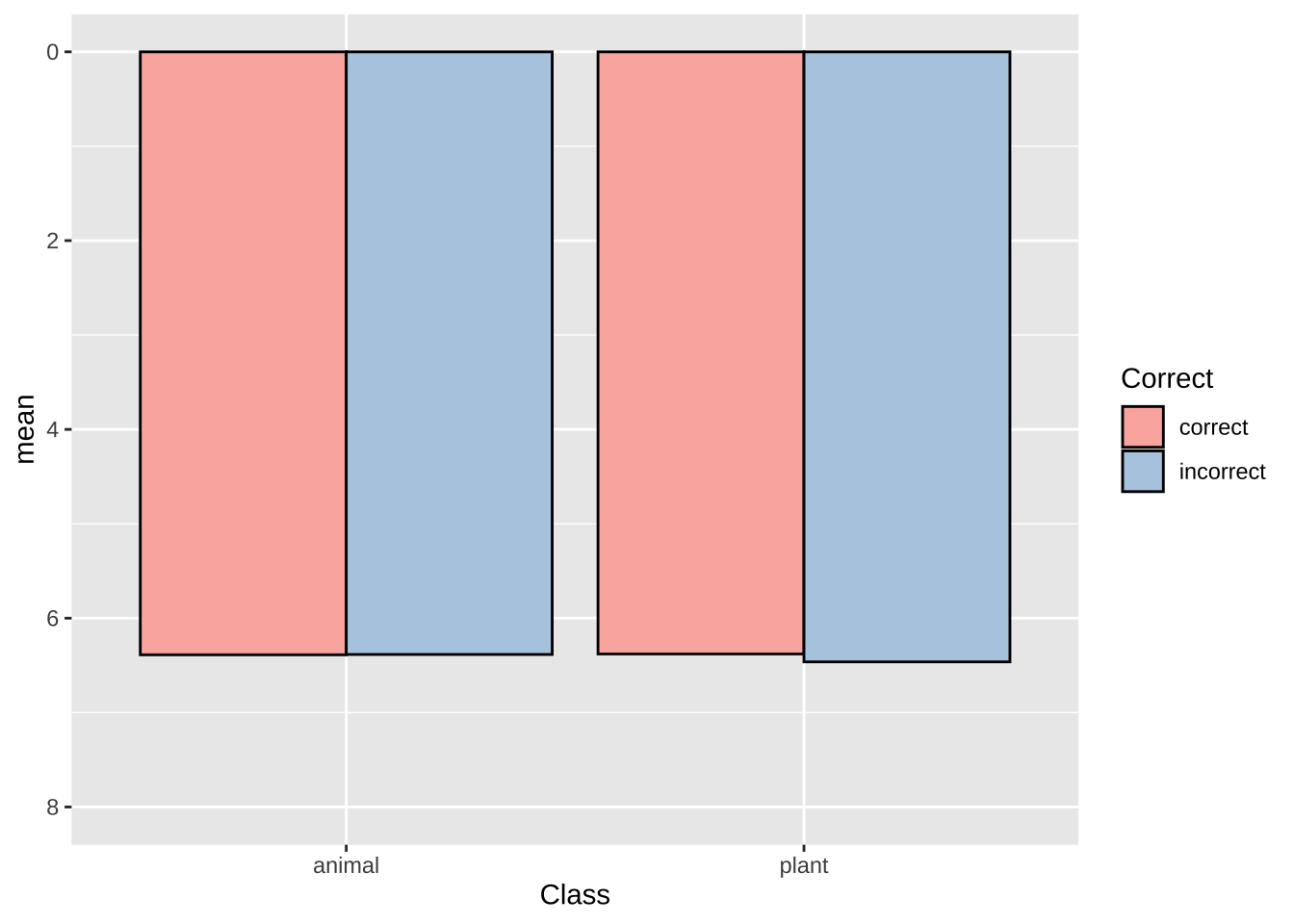
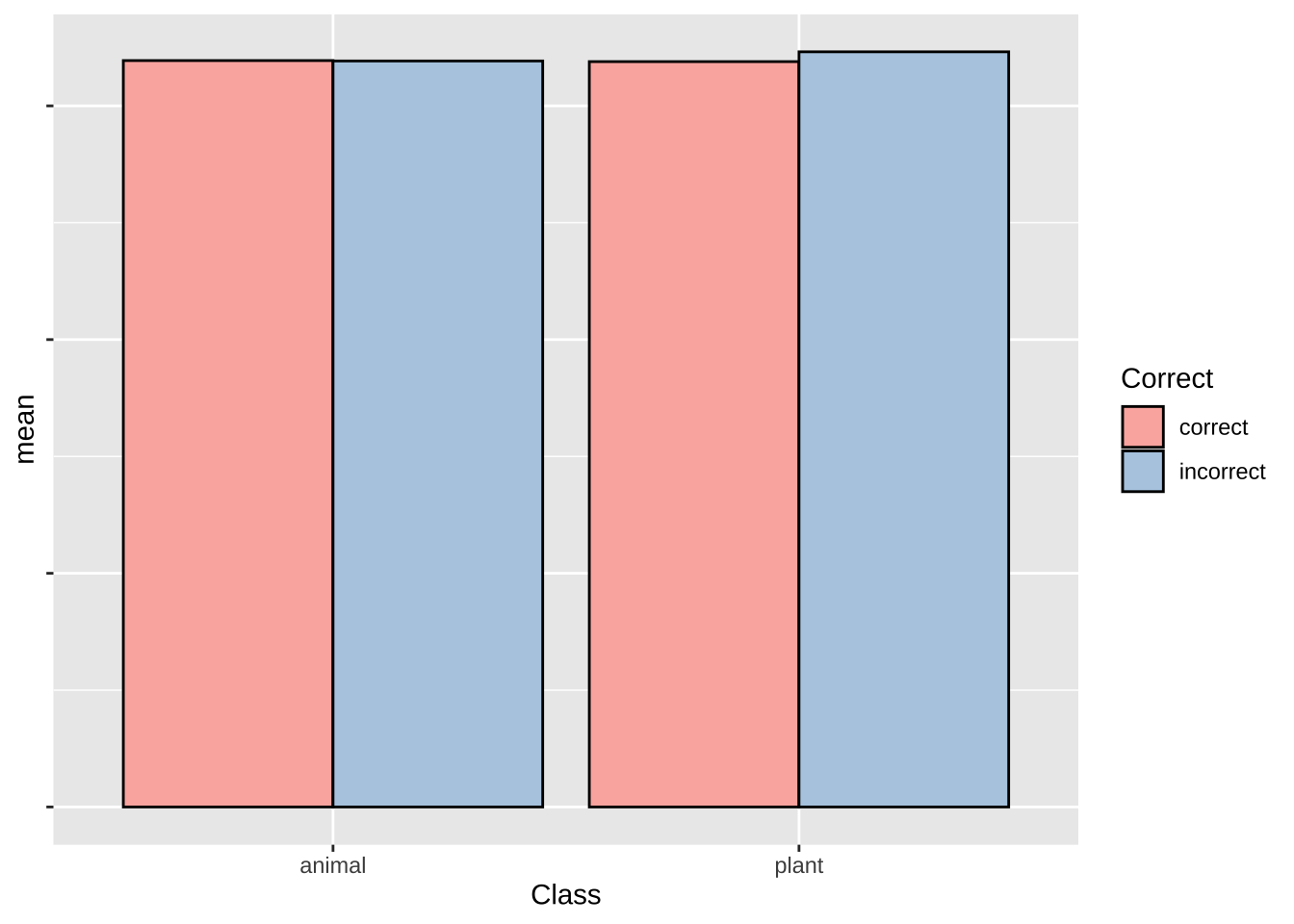
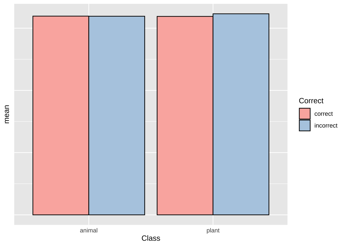
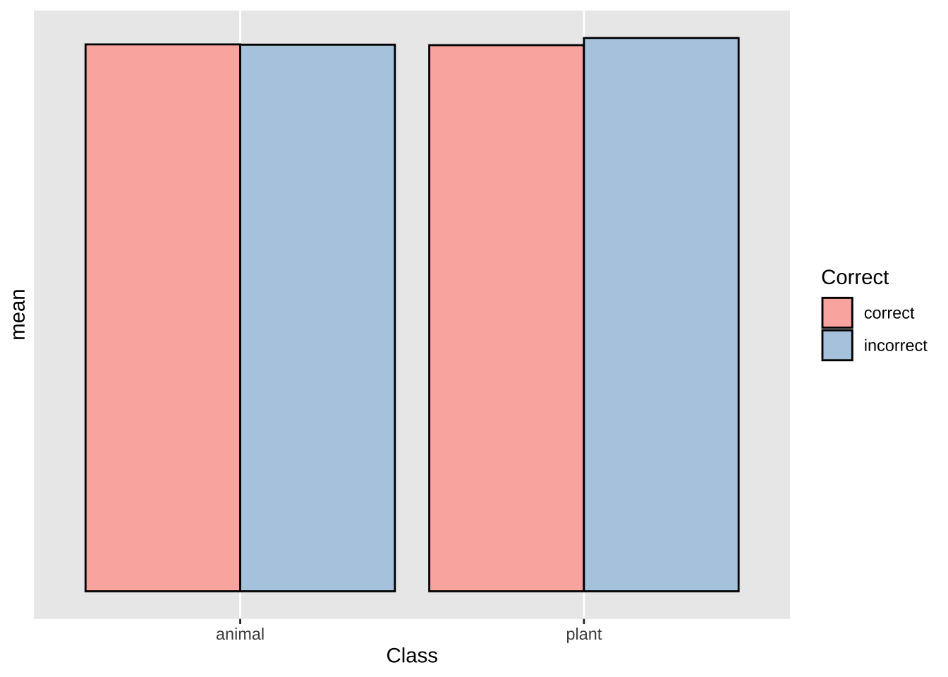
lexdec.plt  +
  scale_y_reverse()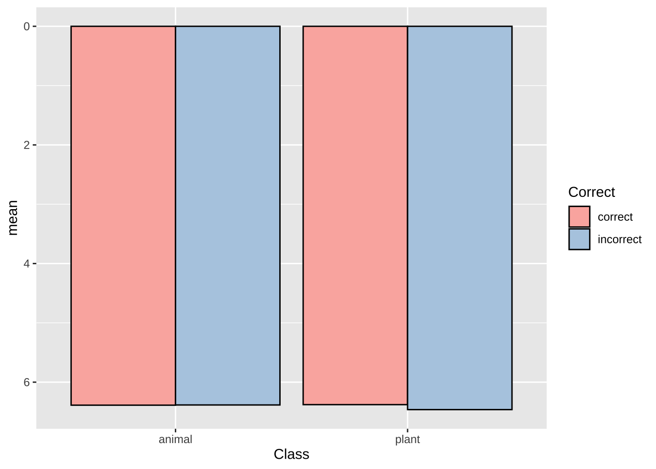
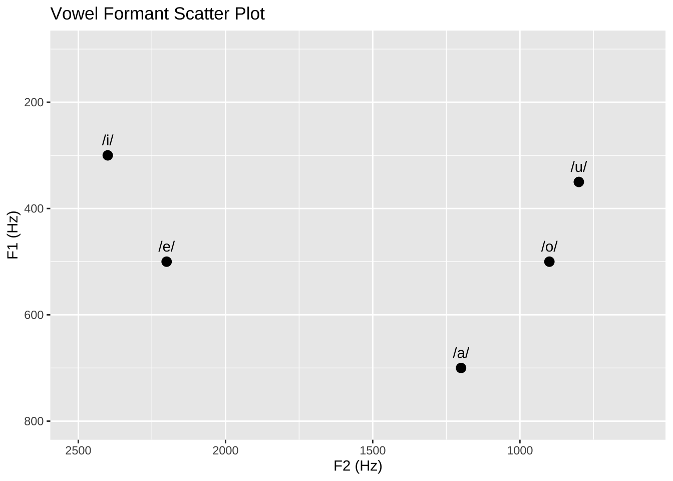
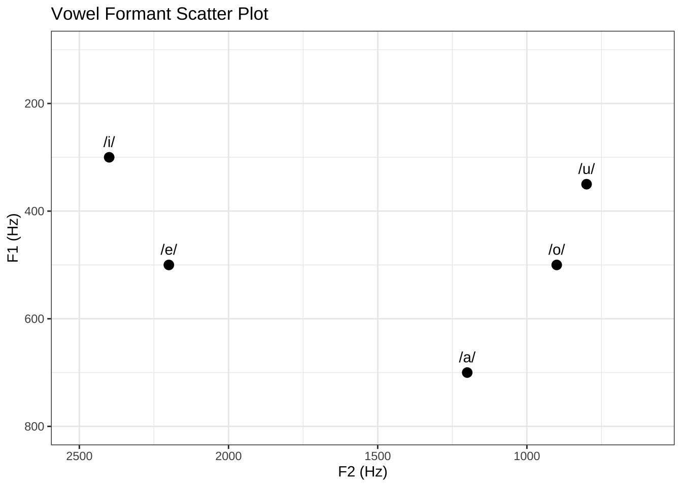
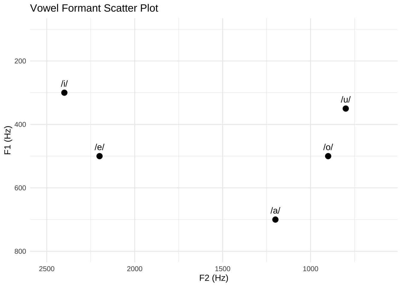
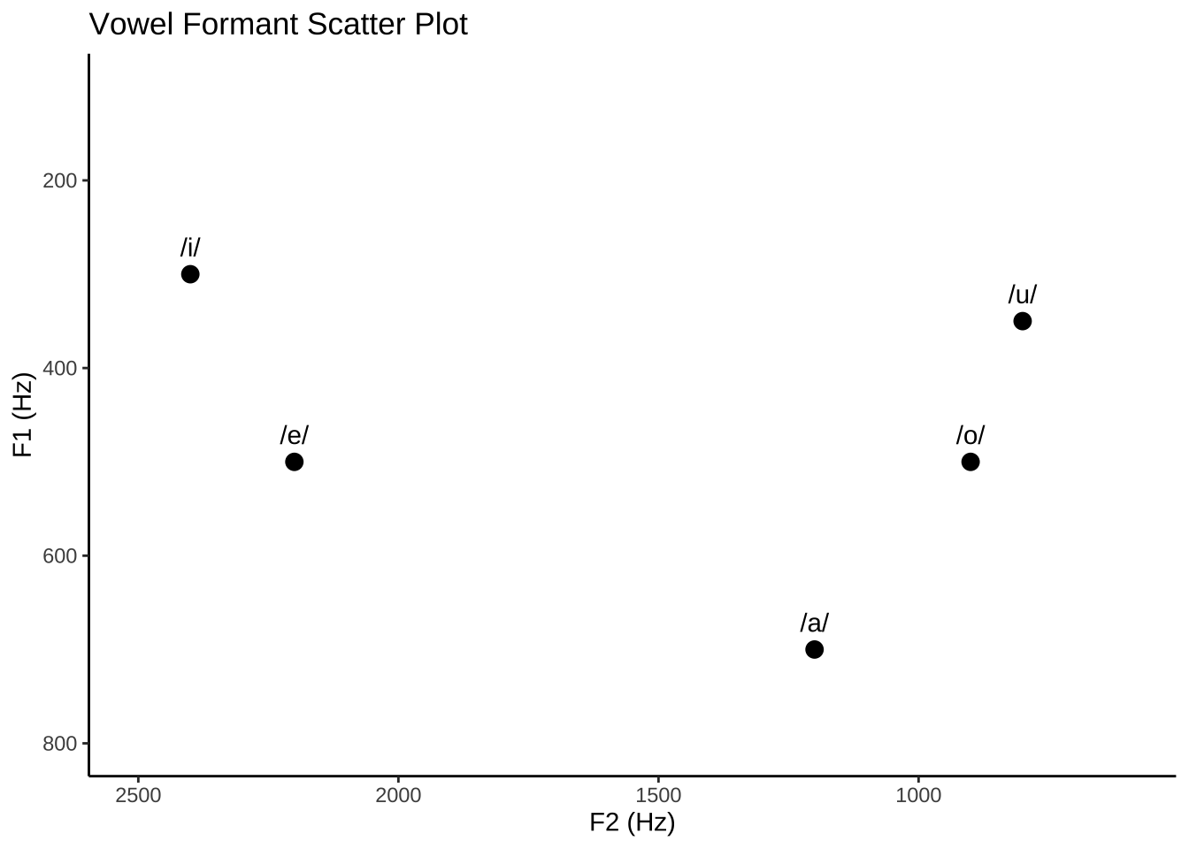
# Create a data frame with the vowel formant data
vowel_data <- data.frame(
  Vowel = c("/i/", "/e/", "/a/", "/o/", "/u/"),
  F1 = c(300, 500, 700, 500, 350),
  F2 = c(2400, 2200, 1200, 900, 800)
)

# Create a scatter plot using ggplot2
vowel.plt = ggplot(vowel_data, aes(x = F2, y = F1, label = Vowel)) +
  geom_point(size = 3) +
  geom_text(vjust = -1, hjust = 0.5) +
  xlab("F2 (Hz)") +
  ylab("F1 (Hz)") +
  scale_y_reverse(limits = c(800, 100))+
  scale_x_reverse(limits = c(2500, 600))+
  ggtitle("Vowel Formant Scatter Plot")

vowel.plt 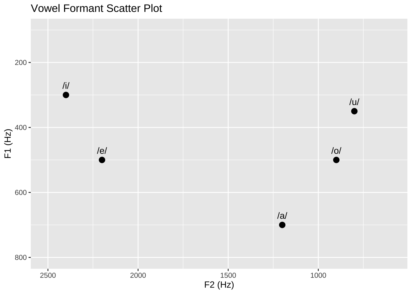
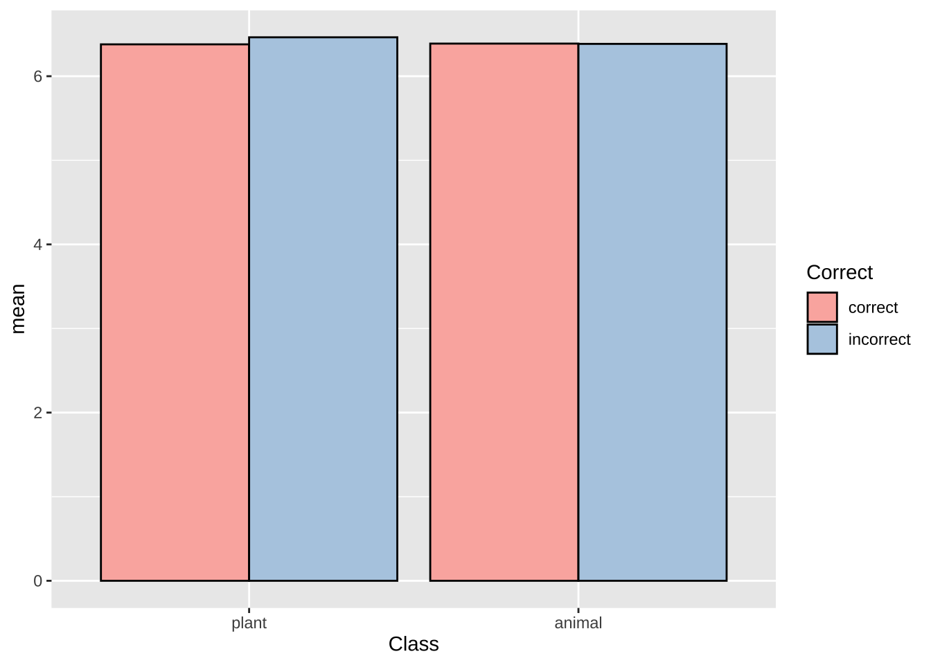
## Warning: Removed 2 rows containing missing values (`geom_col()`).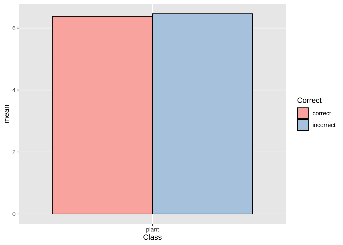
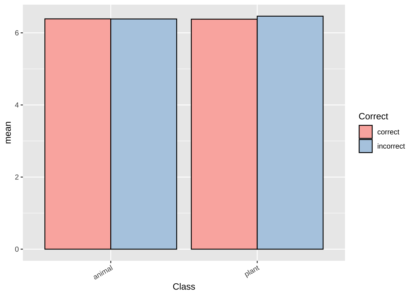
lexdec.plt  +
  theme(
    axis.text.x = element_text(family = "sans", face = "italic",
                               colour = "darkred", size = rel(0.9)))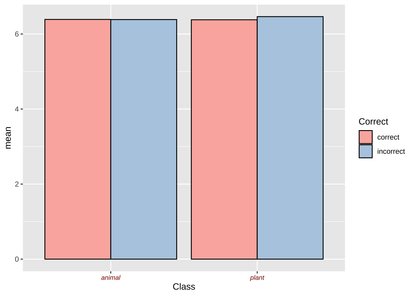
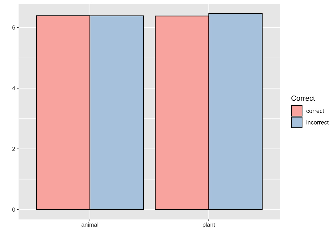
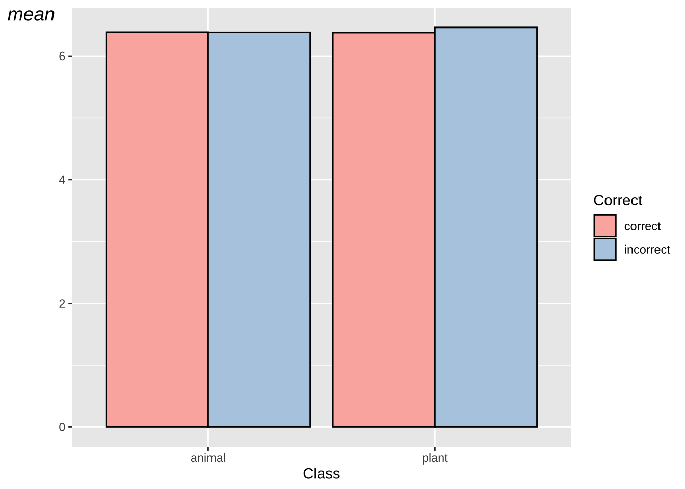
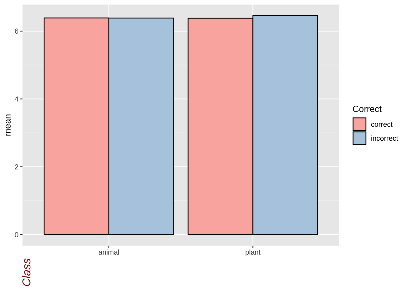
lexdec.plt  +
  theme(axis.title.x = element_text(
    angle = 90,
    face = "italic",
    colour = "darkred",
    size = 14)
  )
lexdec.plt  +
  theme(
    panel.border = element_blank(),
    axis.line = element_line(colour = "blue", size = 2,
                             lineend = "square"))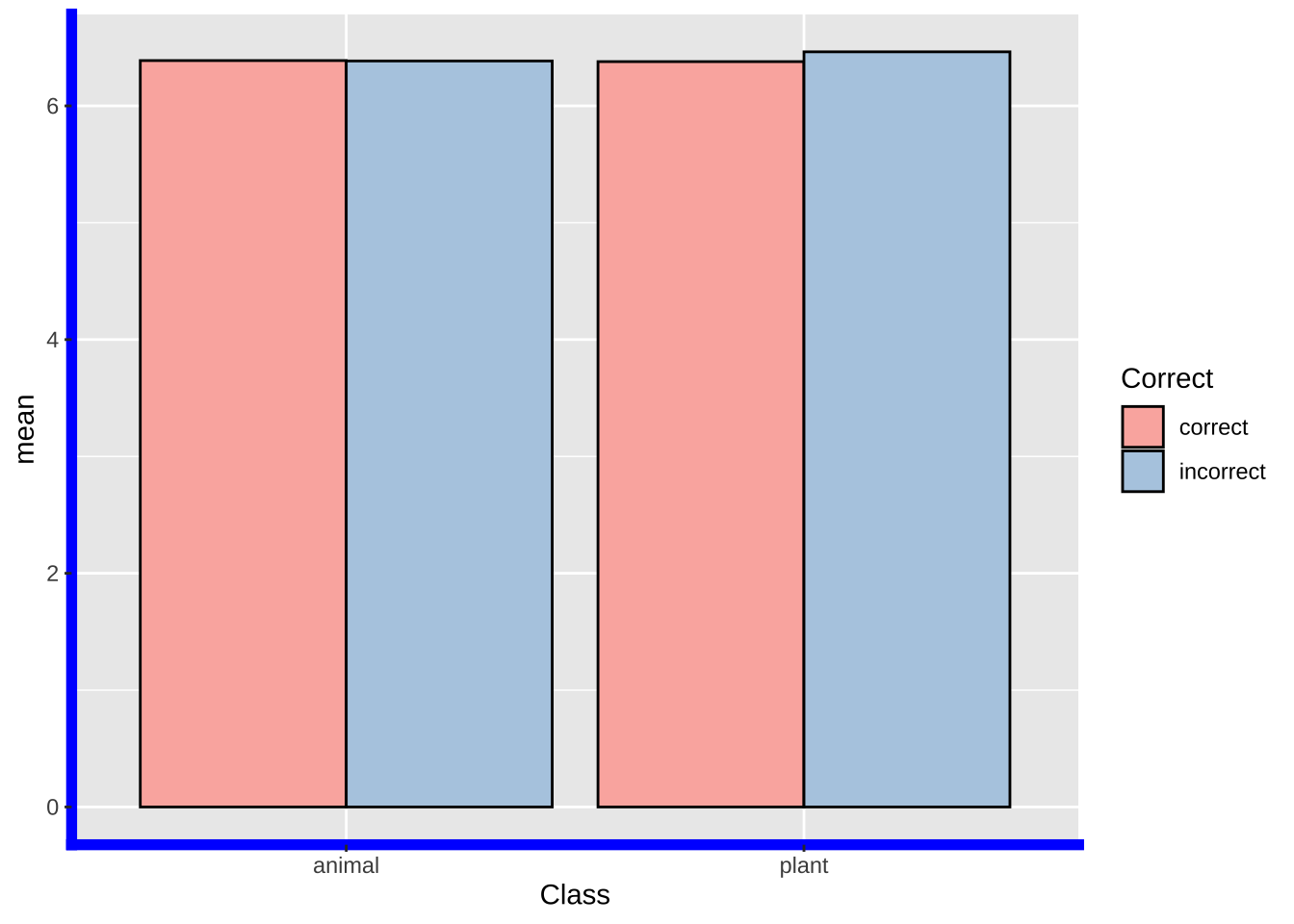
# Create a data frame with the sample BNC word frequency data
bnc_data <- data.frame(
  Word = c("the", "of", "and", "to", "a", "in",
           "that", "is", "was", "it",
           "for", "on", "with", "as", "by",
           "at", "from", "this", "be", "are"),
  Frequency = c(6187266, 2947667, 2687866,
                2595604, 2167570, 1724982, 1037961,
                1017505, 1009930, 989823, 900003,
                892343, 750221, 692788,
                678463, 670544, 567532, 559451, 548621, 541298))

# View the data frame
print(bnc_data)
## Word Frequency
## 1 the 6187266
## 2 of 2947667
## 3 and 2687866
## 4 to 2595604
## 5 a 2167570
## 6 in 1724982
## 7 that 1037961
## 8 is 1017505
## 9 was 1009930
## 10 it 989823
## 11 for 900003
## 12 on 892343
## 13 with 750221
## 14 as 692788
## 15 by 678463
## 16 at 670544
## 17 from 567532
## 18 this 559451
## 19 be 548621
## 20 are 541298# Create a line plot using ggplot2
bnc.plt = ggplot(bnc_data, aes(x = reorder(Word, -Frequency),
y = Frequency, group = 1)) +
geom_line(color = "steelblue", size = 1.2) +
geom_point(color = "darkred", size = 3) +
xlab("Word") +
ylab("Frequency") +
ggtitle("Word Frequency Distribution in BNC") +
#theme_minimal() +
theme(axis.text.x = element_text(angle = 45, hjust = 1))
bnc.plt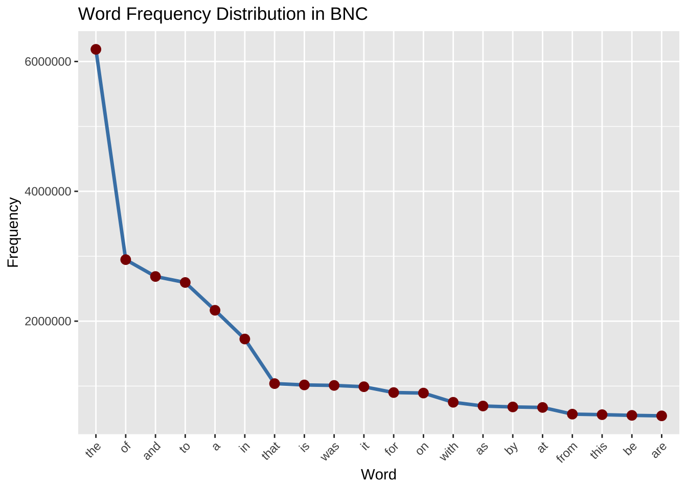
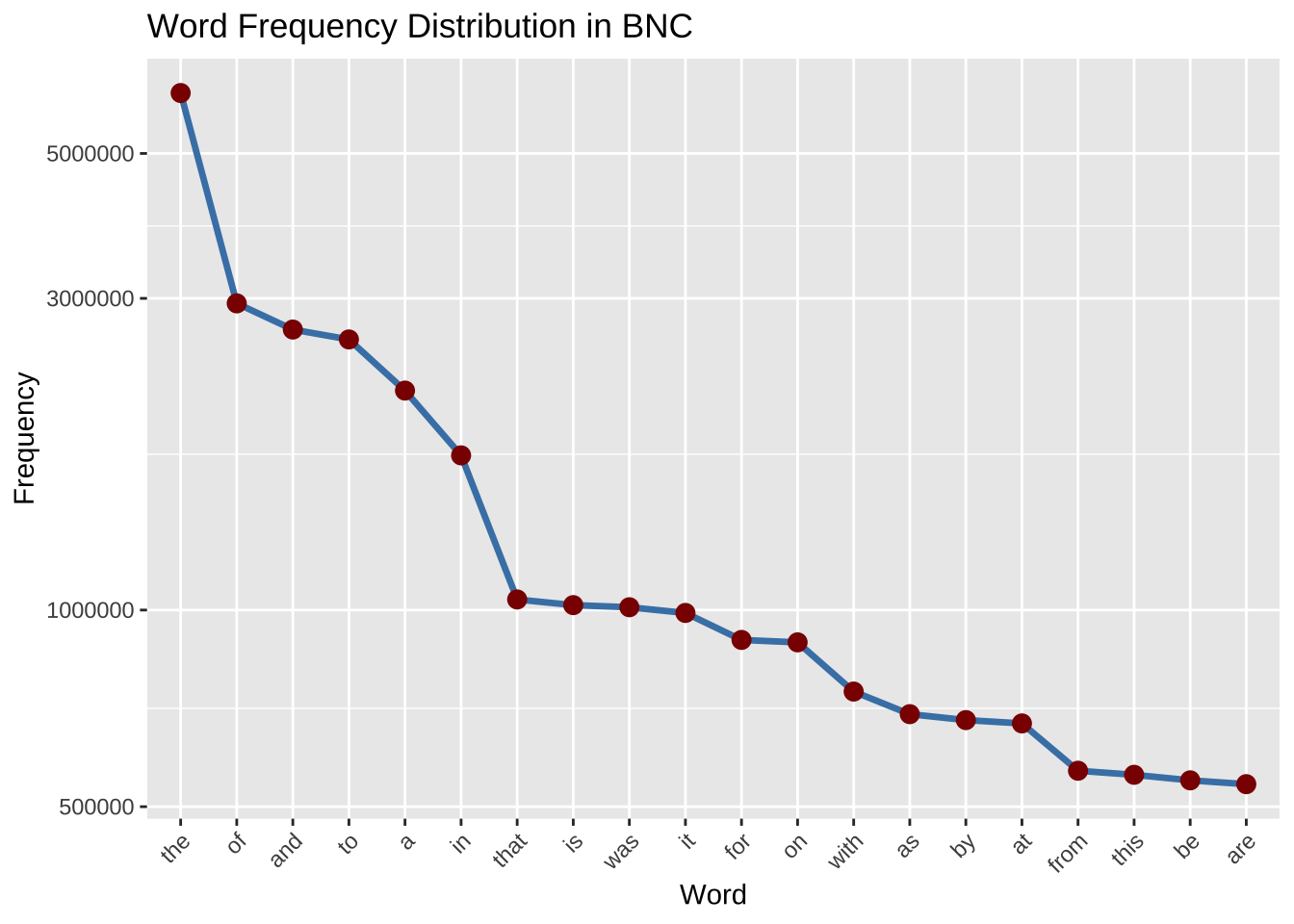
ggplot(bnc_data, aes(x = reorder(Word, -Frequency),
                     y = log10(Frequency), group = 1)) +
  geom_line(color = "steelblue", size = 1.2) +
  geom_point(color = "darkred", size = 3) +
  xlab("Word") +
  ylab("Frequency") +
  ggtitle("Word Frequency Distribution in BNC") +
  #theme_minimal() +
  theme(axis.text.x = element_text(angle = 45, hjust = 1))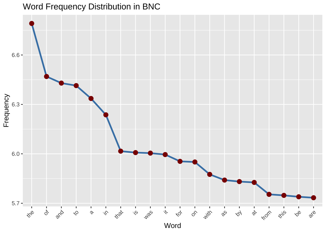
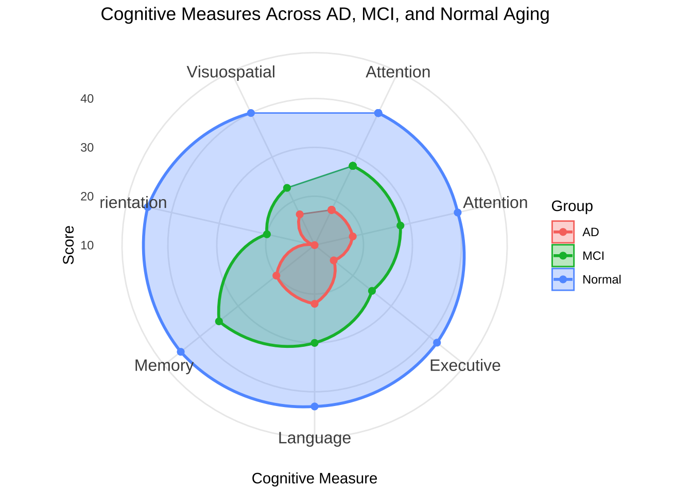
## 极点坐标轴
# Create the dataset
cognitive_data <- data.frame(
  Group = c("AD", "MCI", "Normal"),
  Memory = c(20, 35, 45),
  Language = c(22, 30, 43),
  Attention = c(18, 28, 40),
  Executive = c(15, 25, 42),
  Visuospatial = c(17, 23, 40),
  Orientation = c(10, 20, 45),
  Attention = c(18, 28, 40)
)

# Reshape the data to a long format
cognitive_data_long <- cognitive_data %>%
  pivot_longer(cols = -Group, names_to = "Cognitive_Measure", values_to = "Score")

# Ensure the polygons close by repeating the first measure at the end
cognitive_data_long <- cognitive_data_long %>%
  group_by(Group) %>%
  arrange(Group, Cognitive_Measure) %>%
  bind_rows(mutate(., Cognitive_Measure = first(Cognitive_Measure),
                   Score = first(Score)))

# Create the radar chart using ggplot2
ggplot(cognitive_data_long, aes(x = Cognitive_Measure, y = Score, group = Group, color = Group)) +
  geom_polygon(aes(fill = Group), alpha = 0.3) +
  geom_line(size = 1) +
  geom_point(size = 2) +
  coord_polar() +
  theme_minimal() +
  labs(title = "Cognitive Measures Across AD, MCI, and Normal Aging",
       x = "Cognitive Measure",
       y = "Score") +
  theme(axis.text.x = element_text(size = 12))